

Ignite UI for Angular 変更ログ
Ignite UI for Angular の各バージョンのすべての重要な変更は、このページに記載されています。
このトピックでは、igniteui-angular パッケージに含まれていないコンポーネントの変更についてのみ説明します。 igniteui-angular コンポーネントに固有の変更については CHANGELOG.MD を参照してください。
22.0.1 (July 2026)
一般
-
Angular 22 互換性 — すべての Ignite UI for Angular コンポーネントが Angular 22 と完全に互換性を持つように更新されました。
-
スタンドアロン コンポーネントのサポート —
NgModuleなしでスタンドアロン Angular アプリケーションでコンポーネントを直接使用できるようになりました。新しいprovide*()関数 (例:provideIgxCategoryChart()) を使用してbootstrapApplication()プロバイダーを通じてコンポーネント機能セットを登録でき、DI 不要のセットアップ向けに命令型のregister*()関数も利用可能です。 -
ツリーシェイキング改善のためのコンポーネントごとのエントリ ポイント — 各パッケージは、必要な機能セットのみを登録する名前付きサブパス エントリ ポイント (例:
import 'igniteui-angular-charts/category-chart') を公開するようになりました。ルート パッケージのインポートは完全にサイドエフェクトなしでツリーシェイク可能なままであるため、使用するコンポーネントのみがバンドルされます。DataChart の場合、data-chart-category、data-chart-scatter、data-chart-financialなどの段階的なエントリ ポイントを使用して、チャート全体をバンドルせずに個々のシリーズ ファミリを取り込むことができます。
バグ修正
| バグ番号 | コントロール | 説明 |
|---|---|---|
| 3689 | DataChart | データ ツールチップ レイヤーを含むチャートを破棄するときにエラーがスローされる。 |
21.1.0 (June 2026)
機能拡張
igniteui-angular-charts
MarkerType列挙型にCheckmarkオプションが追加されました。シリーズでMarkerType.Checkmarkを使用すると、円の中に V 字型のチェックマーク アイコンを表示できます。新しいMarkerAutomaticBehavior.Checkmark列挙値でチャート内のすべてのシリーズにチェックマーク形状を適用でき、SeriesViewer.CheckmarkMarkerTemplateプロパティでテンプレートをカスタマイズできます。- マーカーをサポートするチャート シリーズで
MarkerSizeがサポートされ、デバイス非依存ピクセル単位でマーカー サイズを制御できるようになりました。NaNに設定するとテンプレート ベースの既定サイズに戻ります。
バグ修正
| バグ番号 | コントロール | 説明 |
|---|---|---|
| 2189 | IgxDataChart | ラベルがない場合に DataChart が軸のレンダリングをスキップする。 |
| 3055 | IgxDataPieChart | Others スライスのスタイル プロパティが不足している。 |
| 38668 | IgxDataTooltipLayer | チャートの TitleTextColor を使用すると TitleTextColor がオーバーライドされる。 |
| 40238 | Excel | Excel 数式パーサーを修正 - Workbook.Load() が Excel.FormulaParseException をスローする。 |
| 41167 | Excel | オブジェクトの数式がラウンドトリップされない - カメラ ツールのラウンドトリップの Excel サポートを追加。 |
| 41419 | Excel | VBA 署名付き Excel ファイルの保存時に署名/証明書が保持されない。 |
| 41594 | IgxDataChart | AssigningCategoryStyle の args.GetItems が null であるか、フラグメント シリーズのアイテム更新に機能しない。 |
機能拡張
igniteui-angular-charts
IgxDataChartでの水平方向の範囲レンダリングをサポートするRangeBarSeriesが追加されました。
21.0.0 (January 2026)
機能拡張
igniteui-angular-charts
DataPieChart および ProportionalCategoryAngleAxis に OthersCategoryBrush と OthersCategoryOutline を追加しました。
一般
- Angular 21 のサポート。
20.2.1 (December 2025)
バグ修正
| バグ番号 | コントロール | 説明 |
|---|---|---|
| 33808 | IgxDataChart | TimeAxisInterval の IntervalType Ticks に設定されたスケールが表示されない。 |
| 34255 | IgxDataChart | 0.00001 スケールの目盛りが重なって表示される。 |
| 38510 | IgxDataChart | Stacked シリーズの AssigningCategoryStyle イベント サポート。 |
機能拡張
チャート
-
TimeXAxisLabelFormat に LabelFormatOverride イベントが追加され、TimeXAxis のすべての時間形式レベルでイベントを使用して書式設定をオーバーライドできるようになりました。
-
プロパティの有効な値を見つけやすくするために、より多くの項目を考慮するようにスキーマ生成を調整しました。
20.2.0 (November 2025)
igniteui-angular-charts (チャート)
Preview ユーザー注釈

Ignite UI for Angular では、ユーザー注釈機能により、実行時に DataChart にスライス注釈、ストリップ注釈、ポイント注釈を追加できるようになりました。これにより、エンドユーザーは、スライス注釈を使用して会社の四半期レポートなどの単一の重要イベントを強調したり、ストリップ注釈を使用して期間を持つイベントを示したりすることで、プロットに詳細を追加できます。ポイント注釈またはこれら 3 つの任意の組み合わせを使用して、プロットされたシリーズ上の個々のポイントを呼び出すこともできます。
これは、Toolbar のデフォルトのツールと統合されています。
Preview 軸注釈の衝突検出
軸注釈が自動で衝突を検出し、適切に収まるよう切り詰めます。この機能を有効にするには、次のプロパティを設定します:
igniteui-angular-maps (地理マップ)
- Azure Map Imagery は RTM になりました。
バグ修正
| バグ番号 | コントロール | 説明 |
|---|---|---|
| 40136 | Excel Library | Excel ワークブック読み込み時に FormulaParseException 例外が発生する。 |
| 40262 | IgxSpreadsheet | 警告がある場合に #Circularity! が表示される。Excel との一致を要求 — 値 (例: 0) を表示するように改善。 |
| 40458 | IgxSpreadsheet | Arial フォント使用時、igx-spreadsheet がセル内のテキストを切り捨てる。 |
| 40490 | IgxDatePicker | Autofill による入力は日付ピッカーに反映されない。 |
20.1.0 (September 2025)
igniteui-angular-maps (地理マップ)
Preview Azure マップ画像のサポート
IgxGeographicMap は、 Azure ベースのマップ画像をサポートし、開発者は複数のアプリケーション タイプにわたって詳細かつ動的なマップを表示できるようになりました。複数のマップ レイヤーを組み合わせて地理データを視覚化し、インタラクティブなマッピング エクスペリエンスを簡単に作成できます。
注: Bing マップ画像のサポートは段階的に廃止されます。既存のエンタープライズ キーは引き続き Bing Maps にアクセスするために利用できるため、Azure Maps へ移行する間も現在のアプリケーションをそのまま利用可能です。
公開されている Azure Maps の一部はこちらをご覧ください。
igniteui-angular-charts (チャート)
Preview 新しい軸ラベル イベント
軸ラベルに対するさまざまな操作を検出できるように、次のイベントが IgxDataChart に追加されました。
LabelMouseDownLabelMouseUpLabelMouseEnterLabelMouseLeaveLabelMouseMoveLabelMouseClick
Preview 対応軸
X 軸と Y 軸に CompanionAxis プロパティが追加され、既存の軸を簡単に複製できるようになりました。CompanionAxisEnabled プロパティを有効にすると、複製された軸はチャートの反対側に配置され、そこから各軸プロパティを設定できます。
Preview RadialPieSeries インセット アウトライン
RadialPieSeries のアウトライン レンダリング方法を制御するために UseInsetOutlines プロパティが追加されました。true に設定すると、アウトラインがスライス形状の内側に描画され、false (既定値) に設定すると、アウトラインはスライス形状の端に半分内側・半分外側で描画されます。
重大な変更
IgxChartMouseEventArgsクラスのPlotAreaPositionプロパティとChartPositionプロパティが逆になっている問題が修正されました。これにより、PlotAreaPositionとChartPositionが返す値が変更されます。
機能拡張
IgxBulletGraph
Preview 新しいLabelsVisibleプロパティが追加されました。
チャート
-
DataToolTipLayer、ItemToolTipLayer、CategoryToolTipLayer にスタイル設定用の新しいプロパティが追加されました:
ToolTipBackground、ToolTipBorderBrush、およびToolTipBorderThickness。 -
DataLegend にスタイル設定用の新しいプロパティが追加されました:
ContentBackground、ContentBorderBrush、およびContentBorderThickness。ContentBorderBrushとContentBorderThicknessはそれぞれ既定で transparent と 0 に設定されているため、境界線を表示するにはこれらのプロパティを設定する必要があります。 -
マウスのワールド相対位置を提供する
WorldPositionという新しいプロパティがIgxChartMouseEventArgsに追加されました。この位置は、軸空間内の X 軸と Y 軸の両方に対して 0 から 1 の間の値になります。 -
SeriesViewerとDomainChartにHighlightingFadeOpacityが追加されました。ハイライト表示されたシリーズに適用される不透明度を設定できます。 -
ドメイン チャートの
CalloutLabelUpdatingイベントを公開しました。
IgxLinearGauge
Preview 新しいLabelsVisibleプロパティが追加されました。
バグ修正
| バグ番号 | コントロール | 説明 |
|---|---|---|
| 31624 | IgxCategoryChart |
IgxCategoryChart を含むウィンドウをリサイズすると、チャートがシリーズをレンダリングできなくなる。 |
| 27304 | IgxDataChart |
ズーム長方形が背景長方形と同じ位置に配置されない。 |
| 37930 | IgxDataChart |
Data Annotation Overlay のテキスト色が機能しない。 |
| 30600 | IgxDoughnutChart |
チャートやシリーズに textStyle プロパティが存在しない (円チャートにはある)。 |
| 38231 | IgxGrid |
非ピン固定列は、非表示が存在する場合に元の位置に戻らない。 |
| 33861 | Excel Library | 折れ線チャートを追加すると、ドイツ語カルチャで Excel ファイルが破損する。 |
20.0.1 (August 2025)
バグ修正
| バグ番号 | コントロール | 説明 |
|---|---|---|
| 36448 | IgxRadialGauge |
ラジアル ラベルの書式設定プロパティ (例: Title、SubTitles) が機能しない。 |
igniteui-angular-charts (チャート)
- 軸ラベルに使用できる
New MaximumExtentおよびMaximumExtentPercentageプロパティを追加しました。
20.0.0 (June 2025)
- Angular 20 のサポート。
19.0.1 (February 2025)
igniteui-angular-maps 地理マップ
2025 年 6 月 30 日をもって、すべての Microsoft Bing Maps for Enterprise Basic (無料) アカウントはすべて廃止されます。無料の Basic アカウントおよびキーをご利用中の場合は、サービスの中断を回避するために今すぐ対応する必要があります。Bing Maps for Enterprise の有償ライセンスをお持ちの方は、2028 年 6 月 30 日までアプリケーション内で Bing Maps を引き続きご利用いただけます。 詳細は以下をご覧ください:
igniteui-angular-charts (チャート)
-
Preview チャート データ注釈レイヤーを追加しました:- データ注釈バンド レイヤー
- データ注釈ライン レイヤー
- データ注釈矩形レイヤー
- データ注釈スライス レイヤー
- データ注釈ストリップ レイヤー
-
データ ツールチップとデータ 凡例では、ツールチップまたは凡例のコンテンツをテーブルまたは垂直レイアウト構造でレイアウトするために使用できる
Preview LayoutModeプロパティが公開されています。 -
Preview チャートのDefaultInteractionプロパティが更新され、新しい列挙体DragSelectが含まれるようになりました。これにより、ドラッグされたプレビュー Rect は、その中に含まれるポイントを選択します。 (ベータ版) -
Preview ValueOverlay と ValueLayer は、上記にリストしたPreview チャート データ注釈に加えて、プロット領域に追加の注釈テキストをオーバーレイするために使用できるOverlayTextプロパティを公開するようになりました。これらの注釈の外観は、OverlayText プレフィックスが付いた多くのプロパティを使用して構成できます。たとえば、OverlayTextBrushプロパティはオーバーレイ テキストの色を構成します。 (ベータ版) -
New トレンドライン レイヤー シリーズ タイプを使用すると、トレンド ライン レイヤーごとに 1 つのトレンド ラインを特定のシリーズに適用できます。これにより、チャートに複数の TrendlineLayer シリーズ タイプを使用できるため、単一のシリーズで複数のトレンド ラインを使用できるようになります。
igniteui-angular-dashboards (ダッシュボード)
IgxDashboardTileでは、ソート、グループ化、フィルタリング、選択などの集計を DataGrid ビューからチャート視覚化に伝播できるようになりました。これは現在、IgxDashboardTileのIgxDataSourceをIgxLocalDataSourceのインスタンスにバインドすることによってサポートされています。
igniteui-angular
重大な変更
- ‘igniteui-angular-grids’ パッケージの名前が ‘igniteui-angular-data-grids’ に変更されました。
機能拡張
Toolbar
- ツールバーから追加された値レイヤーが凡例に表示されるようになりました。
- ズーム リセット ツールはズーム ドロップダウンに移動されました。
Data Pie Chart
- チャートは
GetOthersContext()メソッドを公開するようになりました。これにより、Others (その他) スライスのコンテンツが返されます。
バグ修正
| バグ番号 | コントロール | 説明 |
|---|---|---|
| 37023 | IgxDataChart |
overflow: hidden が設定されている場合にツールチップが切り取られたり画面外に表示されたりする。 |
| 37685 | IgxSpreadsheet |
Arial フォントで書式設定された数値が正しく描画されない。 |
| 37244 | Excel Library | カスタム データ検証が機能しない。 |
19.0.1 (February 2025)
機能拡張
Toolbar
ToolbarとToolPanelに新しいGroupHeaderTextStyleプロパティを追加しました。設定されている場合、すべてのToolActionGroupHeaderアクションに適用されます。- タイトル テキストの水平方向の配置を制御する
TitleHorizontalAlignmentという新しいプロパティをToolActionに追加しました。 ToolActionSubPanelに、パネル内の項目間の間隔を制御するItemSpacingという新しいプロパティを追加しました。
バグ修正
次の表は、このリリースの Ignite UI for Angular ツールセットに対して行われたバグ修正を示しています。
| バグ番号 | コントロール | 説明 |
|---|---|---|
| 30286 | IgxDataChart |
バブルをクリックすると、Bubble Series のツールチップが近くのバブル データの内容に切り替わる。 |
| 32906 | IgxDataChart |
IgxDataChart は上部に 2 つの xAxis を表示している。 |
| 33605 | IgxDataChart |
凡例に ScatterLineSeries の線の色が正しく表示されない。 |
| 35498 | IgxDataChart |
IncludedSeries で指定されたシリーズのツールチップは表示されない。 |
| 34776 | IgxDataChart |
IgxDataChart を繰り返し表示したり非表示にしたりすると、JS ヒープでメモリ リークが発生する。 |
| 34053 | IgxRadialGauge |
スケール ラベルの位置がずれる。 |
| 35496 | IgxSpreadsheet |
Excel に画像付きでスタイルを設定すると エラーが発生する。 |
| 36176 | Excel Library | LET 関数を含む Excel ブックを読み込むと、例外が発生する。 |
| 36379 | Excel Library | Excel ワークブック内のアルファ チャネルを含む色は読み込まれない。 |
| 26218 | Excel Library | Excel ファイルを読み込むだけで、チャートのプロット領域の右マージンが狭くなり、塗りつぶしパターンと前景の塗りつぶしが消える。 |
| 35495 | Excel Library | テンプレート ファイルを読み込むと、セル内の画像が失われる。 |
| 34083 | Excel Library | テンプレート Excel ファイルのテキストに 「=」 が含まれている場合、TextOperatorConditionalFormat が正しく読み込まれない/保存されない。 |
19.0.0 (January 2025)
- Angular 19 のサポート。
18.2.0 (December 2024)
igniteui-angular-charts (チャート)
Preview Dashboard Tile コンポーネントは、バインドされた ItemsSource コレクションまたは単一のポイントを分析および視覚化し、データのスキーマとカウントに基づいて適切なデータ視覚化を返すコンテナー コントロールです。このコントロールは、組み込みの Toolbar コンポーネントを利用して、実行時に視覚化を変更できるようにし、最小限のコードでデータのさまざまな視覚化を表示できるようにします。
igniteui-angular-charts (入力)
Preview カラー エディターはスタンドアロンのカラー ピッカーとして使用できるようになり、さらに Toolbar コンポーネントのPreview ToolAction に統合され、実行時に視覚化を更新できるようになりました。
18.1.0 (September 2024)
-
データ円チャート -
DataPieChartは円ャートを表示する新しいコンポーネントです。このコンポーネントは、CategoryChartと同様に動作し、基になるデータ モデルのプロパティを自動的に検出しながら、ItemLegend コンポーネントを介して選択、ハイライト表示、アニメーション、凡例のサポートを可能にします。 -
New 比例カテゴリ角度軸 - スライスをプロットするための、DataChartのラジアル円シリーズの新しい軸。円チャートに似ており、データ ポイントが円グラフ内のセグメントとして表されます。 -
Toolbar-
新しい ToolActionCheckboxList 選択用のチェックボックスを備えた項目のコレクションを表示する新しい CheckboxList ToolAction。ToolAction CheckboxList 内のグリッドの高さは 5 項目まで大きくなり、その後スクロールバーが表示されます。 IgxCheckboxListModule を登録する必要があります。
-
新しいフィルタリングのサポート
-
軸フィールドの変更 CategoryChart をターゲットにする場合のツールバーの新しいデフォルトの IconMenu。 ラベル フィールドは X 軸にマップされ、値フィールドは Y 軸にマップされます。 ターゲット チャートは、行われた変更にリアルタイムで反応します。チャートに ItemsSource が設定されていない場合、IconMenu は非表示になります。
-
18.0.0 (June 2024)
- Angular 18 のサポート。
igniteui-angular-charts (チャート)
-
データ凡例のグループ化 と データ ツールチップのグループ化 - 新しいグループ化機能が追加されました。
GroupRowVisibleプロパティは、各シリーズのグループ化を切り替え、オプトインするとDataLegendGroupプロパティを介してグループ テキストを割り当てることができます 同じ値が複数のシリーズに適用されている場合、それらはグループ化されて表示されます。すべてのユーザー向けに分類および整理する必要がある大規模なデータセットに役立ちます。 -
チャートの選択 - 新しいシリーズ選択のスタイル設定。これは、
CategoryChartおよびDataChartのすべてのカテゴリ、財務、およびラジアル シリーズに広く採用されています。シリーズはクリックして異なる色で表示したり、明るくしたり、薄くしたり、フォーカスのアウトラインを表示したりできます。個々のシリーズまたはデータ項目全体を通じて影響を受ける項目を管理します。 複数のシリーズとマーカーがサポートされています。特定のデータ項目の値間のさまざまな相違点や類似点を示すのに役立ちます。また、SelectedSeriesItemsChangedイベントとSelectedSeriesItemsは、選択内容に基づいたデータ分析を行うポップアップやその他の画面など、アプリケーション内で実行できるその他のアクションを取り巻く堅牢なビジネス要件を構築するための追加の支援として利用できます。 -
ツリーマップのハイライト表示 - ツリー マップの項目のマウスオーバーによるハイライト表示を構成できる
HighlightingModeプロパティが公開されました。このプロパティには 2 つのオプションがあります:Brightenでは、マウスを置いた項目にのみハイライト表示が適用され、FadeOthersでは、マウスホバーした項目のハイライト表示はそのままで、それ以外はすべてフェードアウトします。このハイライト表示はアニメーション化されており、HighlightingTransitionDurationプロパティを使用して制御できます。 -
ツリーマップのパーセントベースのハイライト表示 - 新しいパーセントベースのハイライト表示により、ノードはコレクションの進行状況またはサブセットを表すことができます。外観は、データ項目のメンバーによって、または新しい
HighlightedItemsSourceを指定することによって、特定の値までの背景色の塗りつぶしとして表示されます。HighlightedValuesDisplayModeで切り替えることができ、FillBrushesでスタイルを設定できます。 -
Toolbar- 選択した特定のツールの周囲に境界線を描くための ToolAction の新しいIsHighlightedオプション。
igniteui-angular-gauges (ゲージ)
-
RadialGauge- ハイライト針の新しいラベル。
HighlightLabelTextとHighlightLabelSnapsToNeedlePivotおよび、その他の HighlightLabel の多くのスタイル関連プロパティが追加されました。
- ハイライト針の新しいラベル。
18.0.0 (June 2024)
igniteui-angular-charts (チャート)
-
データ凡例のグループ化 と データ ツールチップのグループ化 - 新しいグループ化機能が追加されました。
GroupRowVisibleプロパティは、各シリーズのグループ化を切り替え、オプトインするとDataLegendGroupプロパティを介してグループ テキストを割り当てることができます 同じ値が複数のシリーズに適用されている場合、それらはグループ化されて表示されます。すべてのユーザー向けに分類および整理する必要がある大規模なデータセットに役立ちます。 -
チャートの選択 - 新しいシリーズ選択のスタイル設定。これは、
CategoryChartおよびDataChartのすべてのカテゴリ、財務、およびラジアル シリーズに広く採用されています。シリーズはクリックして異なる色で表示したり、明るくしたり、薄くしたり、フォーカスのアウトラインを表示したりできます。個々のシリーズまたはデータ項目全体を通じて影響を受ける項目を管理します。 複数のシリーズとマーカーがサポートされています。特定のデータ項目の値間のさまざまな相違点や類似点を示すのに役立ちます。また、SelectedSeriesItemsChangedイベントとSelectedSeriesItemsは、選択内容に基づいたデータ分析を行うポップアップやその他の画面など、アプリケーション内で実行できるその他のアクションを取り巻く堅牢なビジネス要件を構築するための追加の支援として利用できます。
igniteui-angular-gauges (ゲージ)
-
RadialGauge- ハイライト針の新しいラベル。
HighlightLabelTextとHighlightLabelSnapsToNeedlePivotおよび、その他の HighlightLabel の多くのスタイル関連プロパティが追加されました。
- ハイライト針の新しいラベル。
17.3.0 (March 2024)
igniteui-angular-charts
InitialFilterプロパティによる新しいデータ フィルタリング。フィルター式を適用して、チャート データをレコードのサブセットにフィルターします。大規模なデータのドリルダウンに使用できます。
igniteui-angular-gauges
17.2.0 (January 2024)
- Save tool action has been added to save the chart to an image via the clipboard.
- Vertical orientation has been added via the toolbar’s
Orientationproperty. By default the toolbar is horizontal, now the toolbar can be shown in vertical orientation where the tools will popup to the left/right respectfully. - Custom SVG icons support was added via the toolbar’s
renderImageFromTextmethod, further enhancing custom tool creation.
igniteui-angular-charts (チャート)
17.0.0 (November 2023)
Preview Toolbar - This component is a companion container for UI operations to be used primarily with our charting components. The toolbar will dynamically update with a preset of properties and tool items when linked to ourDataChartorCategoryChartcomponents. You’ll be able to create custom tools for your project allowing end users to provide changes, offering an endless amount of customization.
igniteui-angular - Toolbar - Preview
-
クリップボードを介してチャートを画像に保存するための保存ツール アクションが追加されました。
-
ツールバーの
Orientationプロパティを介して垂直方向が追加されました。デフォルトでは、ツールバーは水平方向ですが、ツールバーを垂直方向に表示できるようになり、ツールが左右にポップアップ表示されます。 -
ツールバーの
renderImageFromTextメソッドを介してカスタム SVG アイコンのサポートが追加され、カスタム ツールの作成がさらに強化されました。 -
It is now possible to apply a dash array to the different parts of the series of the
DataChart. You can apply this to the series plotted in the chart, the gridlines of the chart, and the trendlines of the series plotted in the chart.
16.1.0 (June 2023)
- Angular 16 support.
新しいコンポーネント
Preview Toolbar - このコンポーネントは、主にチャート コンポーネントで使用される UI 操作のコンパニオン コンテナーです。ツールバーは、DataChartまたはCategoryChartコンポーネントにリンクされると、プロパティとツール項目のプリセットで動的に更新されます。プロジェクト用のカスタム ツールを作成して、エンド ユーザーが変更を提供できるようになり、無限のカスタマイズが可能になります。
igniteui-angular-charts (チャート)
-
ValueLayer -
ValueLayerという名前の新しいシリーズ タイプが公開されました。これにより、Maximum、Minimum、Average など、プロットされたデータのさまざまな焦点のオーバーレイを描画できます。これは、新しいValueLinesコレクションに追加することで、CategoryChartとFinancialChartに適用されます。 -
ダッシュ配列を
DataChartのシリーズのさまざまな部分に適用できるようになりました。これは、チャートにプロットされたシリーズ、チャートのグリッド線、およびチャートにプロットされたシリーズのトレンドラインに適用できます。
The Chart’s Aggregation will not work when using IncludedProperties | ExcludedProperties because these properties are meant for non-aggregated data. Once you attempt to aggregate data these properties should no longer be used. The reason it does not work is because aggregation replaces the collection that is passed to the chart for render. The include/exclude properties are designed to filter in/out properties of that data and those properties no longer exist in the new aggregated collection.
16.0.0 (May 2023)
15.0.0 (December 2022)
- Angular 15 のサポート。
14.2.0 (November 2022)
デフォルトの動作を大幅に改善し、カテゴリ チャート API を改良して使いやすくしました。これらの新しいチャートの改善点は次のとおりです:
13.2.0 (June 2022)
This release introduces a few improvements and simplifications to visual design and configuration options for the geographic map and all chart components.
- Changed
YAxisLabelLocationproperty’s type to YAxisLabelLocation from AxisLabelLocation inFinancialChartandCategoryChart - Changed
XAxisLabelLocationproperty’s type to XAxisLabelLocation from AxisLabelLocation inFinancialChart - Added
XAxisLabelLocationproperty toCategoryChart - Added support for representing geographic series of
GeographicMapin a legend - Added crosshair lines by default in
FinancialChartandCategoryChart - Added crosshair annotations by default in
FinancialChartandCategoryChart - Added final value annotation by default in
FinancialChart - Added new properties in Category Chart and Financial Chart:
CrosshairsLineThicknessand other properties for customizing crosshairs linesCrosshairsAnnotationXAxisBackgroundand other properties for customizing crosshairs annotationsFinalValueAnnotationsBackgroundand other properties for customizing final value annotationsAreaFillOpacitythat allow changing opacity of series fill (e.g. Area chart)MarkerThicknessthat allows changing thickness of markers
- Added new properties in Category Chart, Financial Chart, Data Chart, and Geographic Map:
MarkerAutomaticBehaviorthat allows which marker type is assigned to multiple series in the same chartLegendItemBadgeShapefor setting badge shape of all series represented in a legendLegendItemBadgeModefor setting badge complexity on all series in a legend
- Added new properties in Series in Data Chart and Geographic Map:
LegendItemBadgeShapefor setting badge shape on specific series represented in a legendLegendItemBadgeModefor setting badge complexity on specific series in a legend
- Changed default vertical crosshair line stroke from #000000 to #BBBBBB in category chart and series
- Changed shape of markers to circle for all series plotted in the same chart. This can be reverted by setting chart’s
MarkerAutomaticBehaviorproperty toSmartIndexedenum value - Simplified shapes of series in chart’s legend to display only circle, line, or square. This can be reverted by setting chart’s
LegendItemBadgeModeproperty toMatchSeriesenum value - Changed color palette of series and markers displayed in all charts to improve accessibility
| Old brushes/outlines | New outline/brushes |
|---|---|
| #8BDC5C #8B5BB1 #6DB1FF #F8A15F #EE5879 #735656 #F7D262 #8CE7D9 #E051A9 #A8A8B7 |
#8BDC5C #8961A9 #6DB1FF #82E9D9 #EA3C63 #735656 #F8CE4F #A8A8B7 #E051A9 #FF903B |
igniteui-angular-charts (チャート)
13.1.0 (November 2021)
パッケージ「lit-html」を確認してください。最適な互換性のために、「^2.0.0」以降がプロジェクトに追加されます。
- Changed Bar/Column/Waterfall series to have square corners instead of rounded corners
- Changed Scatter High Density series’ colors for heat min property from #8a5bb1 to #000000
- Changed Scatter High Density series’ colors for heat max property from #ee5879 to #ee5879
- Changed Financial/Waterfall series’
NegativeBrushandNegativeOutlineproperties from #C62828 to #ee5879 - Changed marker’s thickness to 2px from 1px
- Changed marker’s fill to match the marker’s outline for
PointSeries,BubbleSeries,ScatterSeries,PolarScatterSeries. You can use setMarkerFillModeproperty to Normal to undo this change - Compressed labelling for the
TimeXAxisandOrdinalTimeXAxis - New Marker Properties:
- series.
MarkerFillMode- Can be set toMatchMarkerOutlineso the marker depends on the outline - series.
MarkerFillOpacity- Can be set to a value 0 to 1 - series.
MarkerOutlineMode- Can be set toMatchMarkerBrushso the marker’s outline depends on the fill brush color
- series.
- New Series Property:
- series.
OutlineMode- Can be set to toggle the series outline visibility. Note, for Data Chart, the property is on the series
- series.
- New chart properties that define bleed over area introduced into the viewport when the chart is at the default zoom level. A common use case is to provide space between the axes and first/last data points. Note, the
ComputedPlotAreaMarginMode, listed below, will automatically set the margin when markers are enabled. The others are designed to specify aDoubleto represent the thickness, where PlotAreaMarginLeft etc. adjusts the space to all four sides of the chart:- chart.
PlotAreaMarginLeft - chart.
PlotAreaMarginTop - chart.
PlotAreaMarginRight - chart.
PlotAreaMarginBottom - chart.
ComputedPlotAreaMarginMode
- chart.
- New Highlighting Properties
- chart.
HighlightingMode- Sets whether hovered or non-hovered series to fade, brighten - chart.
HighlightingBehavior- Sets whether the series highlights depending on mouse position e.g. directly over or nearest item - Note, in previous releases the highlighting was limited to fade on hover.
- chart.
- Added Highlighting Stacked, Scatter, Polar, Radial, and Shape series:
- Added Annotation layers to Stacked, Scatter, Polar, Radial, and Shape series:
- Added support for overriding the data source of individual stack fragments within a stacked series
- Added custom style events to Stacked, Scatter, Range, Polar, Radial, and Shape series
- Added support to automatically sync the vertical zoom to the series content
- Added support to automatically expanding the horizontal margins of the chart based on the initial labels displayed
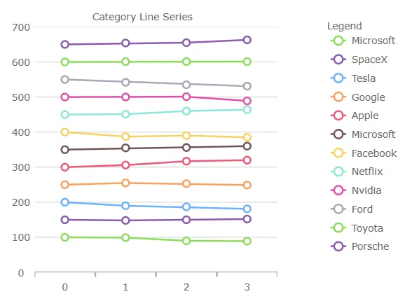
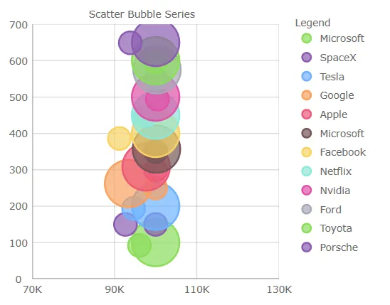
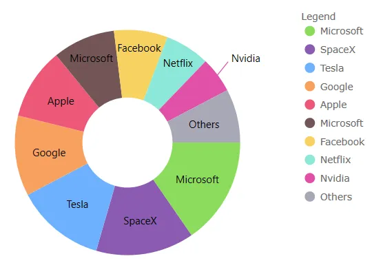
- Redesigned color palette of series and markers:
| Old brushes/outlines | New outline/brushes |
|---|---|
| #7446B9 #9FB328 #F96232 #2E9CA6 #DC3F76 #FF9800 #3F51B5 #439C47 #795548 #9A9A9A |
#8bdc5c #8b5bb1 #6db1ff #f8a15f #ee5879 #735656 #f7d262 #8ce7d9 #e051a9 #a8a8b7 |
for example:
 |
 |
 |
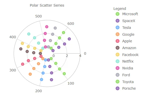 |
igniteui-angular-charts (チャート)
このリリースでは、地理マップとすべてのチャート コンポーネントのビジュアル デザインと構成オプションにいくつかの改善と簡素化が導入されています。
11.2.0 (April 2021)
These features are CTP
- Added support for wrap around display of the map (scroll infinitely horizontally)
- Added support for shifting display of some map series while wrapping around the coordinate origin
- Added support for highlighting of the shape series
- Added support for some annotation layers for the shape series
igniteui-angular-charts (チャート)
このリリースでは、すべてのチャート コンポーネントに、いくつかの新しく改善されたビジュアル デザインと構成オプションが導入されています。例えば、DataChart、CategoryChart、および FinancialChart。
- 棒/縦棒/ウォーターフォール シリーズを、角丸ではなく角が四角になるように変更しました。
- heat min プロパティの 散布高密度シリーズの色を #8a5bb1 から #000000 に変更しました。
- heat max プロパティの 散布高密度シリーズの色を #ee5879 から #ee5879 に変更しました。
- ファイナンシャル/ウォーターフォール シリーズの
NegativeBrushおよびNegativeOutlineプロパティを #C62828 から #ee5879 に変更しました。 - マーカーの厚さを 1px から 2px に変更しました。
PointSeries、BubbleSeries、ScatterSeries、PolarScatterSeriesのマーカーのアウトラインに一致するようにマーカーの塗りつぶしを変更しました。MarkerFillModeプロパティを Normal に設定すると、この変更を元に戻すことができます。TimeXAxisおよびOrdinalTimeXAxisのラベリングを圧縮しました。- 新しいマーカー プロパティ:
- series.
MarkerFillMode- マーカーがアウトラインに依存するように、MatchMarkerOutlineに設定できます。 - series.
MarkerFillOpacity- 0〜1 の値に設定できます。 - series.
MarkerOutlineMode- マーカーのアウトラインが塗りブラシの色に依存するように、MatchMarkerBrushに設定できます。
- series.
- 新シリーズプロパティ:
- series.
OutlineMode- シリーズ アウトラインの表示を切り替えるように設定できます。データ チャートの場合、プロパティはシリーズ上にあることに注意してください。 - チャートがデフォルトのズーム レベルにあるときにビューポートに導入されるブリード オーバー領域を定義する新しいチャート プロパティを追加しました。一般的な使用例では、軸と最初/最後のデータ ポイントの間にスペースを提供します。以下にリストされている
ComputedPlotAreaMarginModeは、マーカーが有効になっているときに自動的にマージンを設定することに注意してください。その他は、厚さを表すDoubleを指定するように設計されており、PlotAreaMarginLeft などがチャートの 4 辺すべてにスペースを調整します: - chart.
PlotAreaMarginLeft - chart.
PlotAreaMarginTop - chart.
PlotAreaMarginRight - chart.
PlotAreaMarginBottom - chart.
ComputedPlotAreaMarginMode
- series.
- 新しいハイライト表示プロパティ:
- chart.
HighlightingMode- ホバーされたシリーズとホバーされていないシリーズをフェードまたは明るくするかを設定します。 - chart.
HighlightingBehavior- 真上または最も近い項目など、マウスの位置に応じてシリーズをハイライト表示するかどうかを設定します。 - 以前のリリースでは、ハイライト表示はホバー時にフェードするように制限されていたことに注意してください。
- chart.
- 積層型、散布図、極座標、ラジアル、図形シリーズにハイライト表示を追加しました。
- 積層型、散布図、極座標、ラジアル、図形注釈レイヤーを追加しました。
- 積層型シリーズ内の個々の積層フラグメントのデータ ソースをオーバーライドするためのサポートが追加されました。
- 積層型、散布、範囲、極座標、ラジアル、シェイプ シリーズにカスタム スタイルのイベントを追加しました。
- 垂直ズームをシリーズ コンテンツに自動的に同期するサポートが追加されました。
- 表示された最初のラベルに基づいてチャートの水平マージンを自動的に拡張するサポートが追加されました。
- シリーズとマーカーの再設計されたカラー パレット:
| 古いのブラシ/アウトライン | 新のアウトライン/ブラシ |
|---|---|
| #7446B9 #9FB328 #F96232 #2E9CA6 #DC3F76 #FF9800 #3F51B5 #439C47 #795548 #9A9A9A |
#8bdc5c #8b5bb1 #6db1ff #f8a15f #ee5879 #735656 #f7d262 #8ce7d9 #e051a9 #a8a8b7 |
例:
| |
|
| |
|
Now, you need to use just package names instead of full paths to API classes and enums.
Please also note that the name of the Data Grid component and its corresponding modules have also changed.
// gauges:
import { IgxLinearGauge } from "igniteui-angular-gauges";
import { IgxLinearGaugeModule } from "igniteui-angular-gauges";
import { IgxLinearGraphRange } from "igniteui-angular-gauges";
import { IgxRadialGauge } from 'igniteui-angular-gauges}';
import { IgxRadialGaugeModule } from 'igniteui-angular-gauges';
import { IgxRadialGaugeRange } from 'igniteui-angular-gauges';
import { SweepDirection } from 'igniteui-angular-core';
// charts:
import { IgxFinancialChartComponent } from "igniteui-angular-charts";
import { IgxFinancialChartModule } from "igniteui-angular-charts";
import { IgxDataChartComponent } from "igniteui-angular-charts";
import { IgxDataChartCoreModule } from "igniteui-angular-charts";
// maps:
import { IgxGeographicMapComponent } from "igniteui-angular-maps";
import { IgxGeographicMapModule } from "igniteui-angular-maps";- Code Before Changes
Before, you had to import using full paths to API classes and enums:
// gauges:
import { IgxLinearGaugeComponent } from 'igniteui-angular-gauges/ES5/igx-linear-gauge-component';
import { IgxLinearGaugeModule } from 'igniteui-angular-gauges/ES5/igx-linear-gauge-module';
import { IgxLinearGraphRange } from 'igniteui-angular-gauges/ES5/igx-linear-graph-range';

import { IgxRadialGaugeComponent } from "igniteui-angular-gauges/ES5/igx-radial-gauge-component";
import { IgxRadialGaugeModule } from "igniteui-angular-gauges/ES5/igx-radial-gauge-module";
import { IgxRadialGaugeRange } from "igniteui-angular-gauges/ES5/igx-radial-gauge-range";
import { SweepDirection } from "igniteui-angular-core/ES5/SweepDirection";

// charts:
import { IgxFinancialChartComponent } from "igniteui-angular-charts/ES5/igx-financial-chart-component";
import { IgxFinancialChartModule } from "igniteui-angular-charts/ES5/igx-financial-chart-module";
import { IgxDataChartComponent } from "igniteui-angular-charts/ES5/igx-data-chart-component";
import { IgxDataChartCoreModule } from "igniteui-angular-charts/ES5/igx-data-chart-core-module";

// maps:
import { IgxGeographicMapComponent } from "igniteui-angular-maps/ES5/igx-geographic-map-component";
import { IgxGeographicMapModule } from "igniteui-angular-maps/ES5/igx-geographic-map-module";