Ignite UI for Blazor 変更ログ
Ignite UI for Blazor の各バージョンのすべての重要な変更は、このページに記載されています。
- バージョン 2024.2 以降、Ignite UI for Blazor ツールセットは .NET 9 をサポートします。.NET 9 の詳細については、Microsoft サイトをご確認ください。
25.1.82 (September 2025)
IgniteUI.Blazor (地理マップ)
重大な変更
AzureMapsMapImageryはIgbAzureMapsImageryに名前が変更されました。IgbAzureMapsImageryはAzureMapsImageryStyle.Satelliteに名前が変更されました。- 次の
AzureMapsImageryStyle列挙値は、Overlay サフィックスを含むように名前が変更されました。TerraOverlayLabelsRoadOverlayLabelsDarkGreyOverlayHybridRoadOverlayHybridDarkGreyOverlayWeatherRadarOverlayWeatherInfraredOverlayTrafficAbsoluteOverlayTrafficRelativeOverlayTrafficRelativeDarkOverlayTrafficDelayOverlayTrafficReducedOverlay
IgniteUI.Blazor (チャート)
新しい軸ラベル イベント
軸ラベルに対するさまざまな操作を検出できるように、次のイベントが DataChart に追加されました。
LabelMouseDownLabelMouseUpLabelMouseEnterLabelMouseLeaveLabelMouseMoveLabelMouseClick
対応軸
X 軸と Y 軸に CompanionAxis プロパティが追加され、既存の軸を簡単に複製できるようになりました。CompanionAxisEnabled プロパティを有効にすると、複製された軸はチャートの反対側に配置され、そこから各軸プロパティを設定できます。
RadialPieSeries インセット アウトライン
IgbRadialPieSeries のアウトライン レンダリング方法を制御するために UseInsetOutlines プロパティが追加されました。true に設定すると、アウトラインがスライス形状の内側に描画され、false (既定値) に設定すると、アウトラインはスライス形状の端に半分内側・半分外側で描画されます。
重大な変更
IgbChartMouseEventArgsクラスのPlotAreaPositionプロパティとChartPositionプロパティが逆になっている問題が修正されました。これにより、PlotAreaPositionとChartPositionが返す値が変更されます。
IgniteUI.Blazor (グリッド)
セル サフィックス コンテンツ
セル内のサフィックス コンテンツのサポートが追加されました。これにより、セル値の末尾にテキストやアイコンを追加してスタイルを設定できるようになりました。セル サフィックス コンテンツに追加されたプロパティの完全なリストは以下に示されており、IgbDataGridColumn および CellInfo クラスで使用できます。
SuffixTextSuffixTextColorSuffixTextFontSuffixIconNameSuffixIconCollectionNameSuffixIconStrokeSuffixIconFillSuffixIconViewBoxLeftSuffixIconViewBoxTopSuffixIconViewBoxWidthSuffixIconViewBoxHeightTextDecoration
アイコンに使用できる最大サイズは 24 x 24 であることに注意してください。これより大きいまたは小さいアイコンを提供することもできますが、アイコンが完全に表示されるように 24x24 のスペースに収まるように適切に拡大縮小するには、ビューボックス設定を構成する必要があります。
バグ修正
| バグ番号 | コントロール | 説明 |
|---|---|---|
| 27304 | IgbDataChart | ズーム長方形が背景長方形と同じ位置に配置されない。 |
| 30600 | IgbDoughnutChart | チャートやシリーズに textStyle プロパティが存在しない (円チャートにはある)。 |
| 31624 | IgbCategoryChart | IgbCategoryChart を含むウィンドウをリサイズすると、チャートがシリーズをレンダリングできなくなる。 |
| 33861 | Excel Library | 折れ線チャートを追加すると、ドイツ語カルチャで Excel ファイルが破損する。 |
| 37307 | IgbCheckBox | IgbCheckBox で JS Heap、ノード、リスナーのリークが発生する。 |
| 37930 | IgbDataChart | Data Annotation Overlay のテキスト色が機能しない。 |
| 38231 | IgbGrid | 非ピン固定列は、非表示が存在する場合に元の位置に戻らない。 |
機能拡張
IgbBulletGraph
- 新しい
LabelsVisibleプロパティが追加されました。
チャート
DataToolTipLayer、ItemToolTipLayer、CategoryToolTipLayer にスタイル設定用の新しいプロパティが追加されました:
ToolTipBackground、ToolTipBorderBrush、およびToolTipBorderThickness。DataLegend にスタイル設定用の新しいプロパティが追加されました:
ContentBackground、ContentBorderBrush、およびContentBorderThickness。ContentBorderBrushとContentBorderThicknessはそれぞれ既定で transparent と 0 に設定されているため、境界線を表示するにはこれらのプロパティを設定する必要があります。マウスのワールド相対位置を提供する
WorldPositionという新しいプロパティがIgbChartMouseEventArgsに追加されました。この位置は、軸空間内の X 軸と Y 軸の両方に対して 0 から 1 の間の値になります。IgbSeriesViewerとIgbDomainChartにHighlightingFadeOpacityが追加されました。ハイライト表示されたシリーズに適用される不透明度を設定できます。
IgbDataGrid
- DataGrid に新しいプロパティ
stopPropagationが追加されました。これにより、マウス イベントが親要素へバブリングするのを防止できます。
IgbLinearGauge
- 新しい
LabelsVisibleプロパティが追加されました。
25.1.63 (August 2025)
IgniteUI.Blazor 地理マップ
Azure マップ画像のサポート
GeographicMap は、 Azure ベースのマップ画像をサポートし、開発者は複数のアプリケーション タイプにわたって詳細かつ動的なマップを表示できるようになりました。複数のマップ レイヤーを組み合わせて地理データを視覚化し、インタラクティブなマッピング エクスペリエンスを簡単に作成できます。
注: Bing マップ画像のサポートは段階的に廃止されます。既存のエンタープライズ キーは引き続き Bing Maps にアクセスするために利用できるため、Azure Maps へ移行する間も現在のアプリケーションをそのまま利用可能です。
公開されている Azure Maps の一部はこちらをご覧ください。
バグ修正
| バグ番号 | コントロール | 説明 |
|---|---|---|
| 26952 | IgbTabs | Razor/JS の Change イベントで e.Detail が null になる問題を修正。 |
| 26953 | IgbTabs | タブを選択状態にしても、その後の操作で選択が反映されない問題を修正。 |
| 31910 | IgbXDatePicker | 「@bind-Value」 構文で値をバインドし、クリア ボタンをクリックするとエラーが発生する問題を修正。 |
| 31323 | IgbDataChart、IgbGrid、IgbCombo | データ タイプにコレクション タイプ プロパティがあり、そのコレクションの最初の要素が null の場合に NullReferenceException が発生する問題を修正。 |
| 38903 | IgbTabs | タブ内に配置されたコンポーネントでドロップダウン リストが正しい位置に表示されない問題を修正。 |
| 139 | IgbDatePicker、IgbDateTimeInput | Date Picker および Date Time Input が null 許容値をサポートしていない問題を修正。 |
一般
以下のコンポーネントのプロパティが null 許容になりました。
IgbButton:FormIgbCalendar:SpecialDates、DisabledDatesIgbCombo:ValueKey、DisplayKey、GroupKeyDatePicker:Value、Min、MaxDateTimePicker:Value、Min、MaxIgbDropdown:SelectedItemIgbInput:Pattern、MinLength、MaxLength、Min、Max、StepSelect:Value、SelectedItemIgbTile:ColStart、RowStartIgbTileManager:MinColumnWidth、MinRowHeight、Gap
25.1.46 (July 2025)
バグ修正
| バグ番号 | コントロール | 説明 |
|---|---|---|
| 36448 | IgbRadialGauge | ラジアル ラベルの書式設定プロパティ (例: Title、SubTitles) が機能しない。 |
| 37718 | IgbTab | タブ パネル内のグリッドに新しい行を追加した際に、予期しないスクロールが発生する。 |
| 37855 | IgbGrid | グリッドに HeaderTemplate が含まれており、ページが安全でない (http) プロトコルを使用してアクセスされた場合、Crypto.randomUID が見つからないというエラーがスローされる。 |
IgniteUI.Blazor (チャート)
- 軸ラベルに使用できる
MaximumExtentおよびMaximumExtentPercentageプロパティを追加しました。
25.1.19 (June 2025)
IgniteUI.Blazor 地理マップ
[!Note] 2025 年 6 月 30 日をもって、すべての Microsoft Bing Maps for Enterprise Basic (無料) アカウントはすべて廃止されます。無料の Basic アカウントおよびキーをご利用中の場合は、サービスの中断を回避するために今すぐ対応する必要があります。Bing Maps for Enterprise の有償ライセンスをお持ちの方は、2028 年 6 月 30 日までアプリケーション内で Bing Maps を引き続きご利用いただけます。 詳細は以下をご覧ください:
IgniteUI.Blazor (チャート)
チャート データ注釈レイヤーを追加しました:
- データ注釈バンド レイヤー
- データ注釈ライン レイヤー
- データ注釈矩形レイヤー
- データ注釈スライス レイヤー
- データ注釈ストリップ レイヤー
データ ツールチップとデータ 凡例では、ツールチップまたは凡例のコンテンツをテーブルまたは垂直レイアウト構造でレイアウトするために使用できる
LayoutModeプロパティが公開されています。チャートの
DefaultInteractionプロパティが更新され、新しい列挙体DragSelectが含まれるようになりました。これにより、ドラッグされたプレビュー Rect は、その中に含まれるポイントを選択します。 (ベータ版)ValueOverlay と ValueLayer は、上記にリストした チャート データ注釈に加えて、プロット領域に追加の注釈テキストをオーバーレイするために使用できる
OverlayTextプロパティを公開するようになりました。これらの注釈の外観は、OverlayText プレフィックスが付いた多くのプロパティを使用して構成できます。たとえば、OverlayTextBrushプロパティはオーバーレイ テキストの色を構成します。 (ベータ版)トレンドライン レイヤー シリーズ タイプを使用すると、トレンド ライン レイヤーごとに 1 つのトレンド ラインを特定のシリーズに適用できます。これにより、チャートに複数の TrendlineLayer シリーズ タイプを使用できるため、単一のシリーズで複数のトレンド ラインを使用できるようになります。
一般
IgbTooltipは、特定の要素のツールチップを表示する方法を提供します。使用するには、必要に応じてコンテンツを設定し、Anchorプロパティを介してターゲット要素の ID にリンクします。<IgbButton id="target-button">Hover me</IgbButton> <IgbTooltip Anchor="target-button"> You've hovered the button! 🎉 </IgbTooltip>ツールチップは、
Show/HideDelay、ターゲットの周囲へのPlacement、カスタマイズ可能なShow/HideTriggersイベントを使用してさらにカスタマイズできます。
変更内容
いくつかの列挙は名前が変更され、他の列挙と統合されました。名前の変更 (影響を受けるコンポーネントを含む):
BaseAlertLikePosition(IgbSnackbarとIgbToast) はAbsolutePositionに名前が変更されました。ButtonGroupAlignment(IgbButtonGroup)、CalendarOrientation(IgbCalendar)、CardActionsOrientation(IgbCardActions)、DatePickerOrientation(DatePicker)、RadioGroupAlignment(IgbRadioGroup) が統合され、ContentOrientationに名前が変更されました。CalendarBaseSelection(IgbCalendar) はCalendarSelectionに名前が変更されました。CarouselAnimationType(IgbCarousel) とStepperHorizontalAnimation(IgbStepper) が統合され、HorizontalTransitionAnimationに名前が変更されました。CheckboxBaseLabelPosition(IgbCheckboxとIgbSwitch) とRadioLabelPosition(IgbRadio) が統合され、ToggleLabelPositionに名前が変更されました。DatePickerMode(DatePicker) はPickerModeに名前が変更されました。DatePickerHeaderOrientation(DatePicker) はCalendarHeaderOrientationに名前変更/統合されました。DropdownPlacement(IgbDropdownとSelect) はPopoverPlacementに名前が変更されました。DropdownScrollStrategy(IgbDropdown) とSelectScrollStrategy(Select) が統合され、PopoverScrollStrategyに名前が変更されました。SliderBaseTickOrientation(IgbSliderおよびIgbRangeSlider) の名前がSliderTickOrientationに変更されました。TickLabelRotation(IgbSliderとIgbRangeSlider) の名前がSliderTickLabelRotationに変更されました。
IgbTabs設定を簡素化し、タブヘッダーとパネルを個別に定義してリンクする必要がなくなりました。PanelプロパティとTabPanel自体は削除されました。コンテンツをIgbTabに直接割り当てることができるようになり、ヘッダー テキストは新しいLabelプロパティを介して、または要素をslot="label"に投影してより複雑なカスタマイズを行うことで簡単に設定できるようになりました。前:
<IgbTabs Alignment=@TabAlignment>
    <IgbTab Panel="basics">Basics</IgbTab>
    <IgbTab Panel="details">Details</IgbTab>
    <IgbTab Panel="favorite">
        <IgbIcon IconName="favorite" Collection="material"/>
    </IgbTab>
    <IgbTab Panel="disabled" Disabled=true>Disabled</IgbTab>
    <IgbTabPanel id="basics">Basics tab content</IgbTabPanel>
    <IgbTabPanel id="details">Details tab content</IgbTabPanel>
    <IgbTabPanel id="favorite">Favorite tab content</IgbTabPanel>
    <IgbTabPanel id="disabled">Disabled tab content will not be displayed</IgbTabPanel>
</IgbTabs>
後:
<IgbTabs Alignment=@TabAlignment> <IgbTab Label="Basics"> Basics tab content </IgbTab> <IgbTab Label="Details"> Details tab content </IgbTab> <IgbTab> <IgbIcon slot="label" IconName="favorite" Collection="material"/> Favorite tab content </IgbTab> <IgbTab Disabled="true" Label="Disabled"> Disabled tab content will not be displayed </IgbTab> </IgbTabs>-
ActiveStepChangingArgsEventArgsはIgbActiveStepChangingEventArgsに名前が変更されました。ActiveStepChangedArgsEventArgsはIgbActiveStepChangedEventArgsに名前が変更されました。StepperTitlePositionはデフォルトの動作を正しく反映するためにデフォルトでAutoになりました。
-
TreeSelectionChangeEventArgsはIgbTreeSelectionEventArgsに名前が変更されました。
-
AutocapitalizeとInputModeは明示的な列挙型ではなくstringプロパティになりました。
IgniteUI.Blazor (グリッド)
IgbColumn- 追加されたイベント:
HiddenChange、ExpandedChange、WidthChange、PinnedChange。
- 追加されたイベント:
Grid- 追加されたイベント:
GroupingExpressionsChange、GroupingExpansionStateChange。
- 追加されたイベント:
IgbRowIslandGridCreatedイベントのIgbGridCreatedEventArgsDetail引数に新しいパラメーターParentRowDataを追加しました。
Grid、IgbHierarchicalGrid、IgbTreeGrid- 追加されたプロパティ -
ExpansionStates- キーと値のペア [行 Id、展開状態] のリストを表します。 - 追加されたイベント:
ExpansionStatesChange。 RenderedイベントのタイプがVoidHandlerからComponentBoolValueChangedEventHandlerに変更されました。- DataChanging イベントのタイプが
ForOfDataChangingEventHandlerからForOfDataChangeEventHandlerに変更されました。 - DataChanged イベントのタイプが
VoidHandlerからForOfDataChangeEventHandlerに変更されました。
- 追加されたプロパティ -
IgbPivotDataSelector- 追加されたイベント:
ColumnsExpandedChange、RowsExpandedChange、FiltersExpandedChange、ValuesExpandedChange。
- 追加されたイベント:
IgniteUI.Blazor (ダッシュボード)
DashboardTileでは、ソート、グループ化、フィルタリング、選択などの集計を DataGrid ビューからチャート視覚化に伝播できるようになりました。これは現在、DashboardTileのDataSourceをIgbLocalDataSourceのインスタンスにバインドすることによってサポートされています。
機能拡張
Toolbar
- ツールバーから追加された値レイヤーが凡例に表示されるようになりました。
- ズーム リセット ツールはズーム ドロップダウンに移動されました。
Data Pie Chart
- チャートは
GetOthersContext()メソッドを公開するようになりました。これにより、Others (その他) スライスのコンテンツが返されます。
バグ修正
| バグ番号 | コントロール | 説明 |
|---|---|---|
| 25997 | IgbDataGrid | 集計はグループ化された最初の子行にのみ表示される。 |
| 37023 | IgbDataChart | overflow: hidden が設定されている場合にツールチップが切り取られたり画面外に表示されたりする。 |
| 37244 | Excel | カスタム データ検証が機能しない。 |
24.2.122 (May 2025)
バグ修正
| バグ番号 | コントロール | 説明 |
|---|---|---|
| 37271 | IgbHierarchicalGrid | ParentRowData が IGridCreatedEventArgs に追加される問題。 |
| 37681 | IgbDataChart | カテゴリ チャート - 十分なスペースがあるにもかかわらず、値ラベルが縦棒の上に表示されない。 |
| 37244 | Excel | カスタム データ検証が機能しない。 |
24.2.111 (April 2025)
新しいコンポーネント
- IgbTileManager
機能拡張
List
IgbListItemに新しいプロパティSelectedを追加しました。
Accordion
- 新しいイベント
OpenおよびCloseを追加しました。
IgniteUI.Blazor
- すべてのグリッド
FilteringExpressionsTreeプロパティを使用して初期フィルタリングの適用が可能になりました。
バグ修正
| バグ番号 | コントロール | 説明 |
|---|---|---|
| 25602 | IgbDataGrid | 日付特有のフィルター演算子を含むレイアウトを読み込むと、TypeError がコンソールに出力される。 |
| 28480 | IgbCombo | データ ソースを置き換えた際に未定義の参照エラーが発生する。 |
| 32598 | IgbDataGrid | 複数選択が正しく動作しない。 |
| 36374 | IgbInput | タッチ デバイスでフォームを送信すると、以前の値がバインドされる。 |
| 37214 | 一般 | Blazor の WebCallback.Register() で断続的にエラーが発生する。 |
24.2.92 (March 2025)
IgniteUI.Blazor
- すべてのグリッド
- グリッドの列に新しい
DisabledSummariesが追加され、開発者が一部の集計をスキップできるようにしました。 - 内部グリッド アクション ボタンをカプセル化しました。
- グリッドの列に新しい
バグ修正
| バグ番号 | コントロール | 説明 |
|---|---|---|
| 35497 | IgbDialog | ShowAsync と HideAsync が呼び出されると、後続のコードは実行されない。 |
24.2.85 (February 2025)
機能拡張
Toolbar
ToolbarとIgbToolPanelに新しいGroupHeaderTextStyleプロパティを追加しました。設定されている場合、すべてのIgbToolActionGroupHeaderアクションに適用されます。- タイトル テキストの水平方向の配置を制御する
TitleHorizontalAlignmentという新しいプロパティをIgbToolActionに追加しました。 IgbToolActionSubPanelに、パネル内の項目間の間隔を制御するItemSpacingという新しいプロパティを追加しました。
バグ修正
次の表は、このリリースの Ignite UI for Blazor ツールセットに対して行われたバグ修正を示しています。
| バグ番号 | コントロール | 説明 |
|---|---|---|
| 26218 | Excel Library | Excel ファイルを読み込むだけで、チャートのプロット領域の右マージンが狭くなり、塗りつぶしパターンと前景の塗りつぶしが消える。 |
| 29998 | IgbCombo | .NET 8 では Change イベントコールバックが複数回発生する。 |
| 30286 | IgbDataChart | バブルをクリックすると、Bubble Series のツールチップが近くのバブル データの内容に切り替わる。 |
| 31344 | IgbGrid | SelectedRows の双方向バインディングが機能しない。 |
| 32906 | IgbDataChart | IgbDataChart は上部に 2 つの xAxis を表示している。 |
| 33605 | IgbDataChart | 凡例に ScatterLineSeries の線の色が正しく表示されない。 |
| 34053 | IgbRadialGauge | スケール ラベルの位置がずれる。 |
| 34083 | Excel Library | テンプレート Excel ファイルのテキストに 「=」 が含まれている場合、TextOperatorConditionalFormat が正しく読み込まれない/保存されない。 |
| 34149 | IgbGrid | IgbGrid を繰り返し表示したり非表示にしたりすると、JS ヒープでメモリ リークが発生する。 |
| 34224 | IgbGrid | rendermode に 'InteractiveAuto' が使用されている場合、アプリがサーバー モードから WebAssembly モードに変更されると、「There are multiple .NET runtimes present」 というエラーが発生する。 |
| 34654 | IgbGrid | データに空のリストが含まれている場合、NullReferenceException が発生する。 |
| 34776 | IgbDataChart | IgbDataChart を繰り返し表示したり非表示にしたりすると、JS ヒープでメモリ リークが発生する。 |
| 35439 | IgbGrid | アプリを複数のタブで開いた際に、CPU 使用率とメモリ消費が異常に高くなる。 |
| 35495 | Excel Library | テンプレート ファイルを読み込むと、セル内の画像が失われる。 |
| 35498 | IgbDataChart | IncludedSeries で指定されたシリーズのツールチップは表示されない。 |
| 36024 | IgbGrid | IgbGrid コンポーネントを含む 2 つのページ間を行き来しても、JS ヒープ サイズが削減されない。 |
| 36176 | Excel Library | LET 関数を含む Excel ブックを読み込むと、例外が発生する。 |
| 36379 | Excel Library | Excel ワークブック内のアルファ チャネルを含む色は読み込まれない。 |
24.2.71 (January 2025)
- バグ修正
IgniteUI.Blazor
- すべてのグリッド
- 複数の重複したブラウザー タブでコンポーネントが開かれた場合に発生する重大なメモリ リークを修正しました。
24.2.52 (December 2024)
IgniteUI.Blazor (チャート)
- Dashboard Tile コンポーネントは、バインドされた ItemsSource コレクションまたは単一のポイントを分析および視覚化し、データのスキーマとカウントに基づいて適切なデータ視覚化を返すコンテナー コントロールです。このコントロールは、組み込みの Toolbar コンポーネントを利用して、実行時に視覚化を変更できるようにし、最小限のコードでデータのさまざまな視覚化を表示できるようにします。
IgniteUI.Blazor (入力)
- カラー エディターはスタンドアロンのカラー ピッカーとして使用できるようになり、さらに Toolbar コンポーネントの ToolAction に統合され、実行時に視覚化を更新できるようになりました。
重大な変更
- バージョン 2024.2 のリリースでは、Microsoft .NET ライフサイクルに従い、.NET 3.1、.NET 5、.NET 7 はサポートされなくなりました。
24.2.19 (November 2024)
一般
- 新しい Carousel コンポーネント。
IgbInputchangeイベント引数タイプをIgbComponentDataValueChangedEventArgsからIgbComponentValueChangedEventArgsに変更しました。
24.1.46 (September 2024)
IgniteUI.Blazor (チャート)
新しいデータ円チャート -
IgbDataPieChartは円ャートを表示する新しいコンポーネントです。このコンポーネントは、IgbCategoryChartと同様に動作し、基になるデータ モデルのプロパティを自動的に検出しながら、ItemLegend コンポーネントを介して選択、強調表示、アニメーション、凡例のサポートを可能にします。新しい 比例カテゴリ角度軸 - スライスをプロットするための、
IgbDataChartのラジアル円シリーズの新しい軸。円チャートに似ており、データ ポイントが円グラフ内のセグメントとして表されます。-
新しい ToolActionCheckboxList。 選択用のチェックボックスを備えた項目のコレクションを表示する新しい CheckboxList ToolAction。ToolAction CheckboxList 内のグリッドの高さは 5 項目まで大きくなり、その後スクロールバーが表示されます。 IgbCheckboxListModule を登録する必要があります。
新しいフィルタリングのサポート。
軸フィールドの変更。 CategoryChart をターゲットにする場合のツールバーの新しいデフォルトの IconMenu。 ラベル フィールドは X 軸にマップされ、値フィールドは Y 軸にマップされます。 ターゲット チャートは、行われた変更にリアルタイムで反応します。チャートに ItemsSource が設定されていない場合、IconMenu は非表示になります。
一般
- 新しい Banner コンポーネント。
- 新しい DatePicker コンポーネント。
- 新しい
IgbDividerコンポーネント。 IgbIconSetIconRefメソッドが追加されました。これにより、アイコンを SVG ファイルで登録および置き換えることができます。- すべてのコンポーネントが内部的な参照によるアイコンを使用するようになり、カスタム テンプレートを明示的に提供しなくても簡単に置き換えられるようになりました。
IgbCombo、DatePicker、IgbDialog、IgbDropdown、IgbExpansionPanel、IgbNavDrawer、IgbToast、IgbSnackbar、IgbSelectComponent- トグル メソッドの
Show、Hide、Toggleメソッドは、成功した場合に true を返すようになりました。そうでない場合は false。
- トグル メソッドの
IgbRadioGroup
重大な変更:
- 古い IgbDatePicker の名前を IgbXDatePicker に変更しました。
Formコンポーネントを削除しました。代わりにネイティブのフォームを使用してください。- 以下のコンポーネントの
sizeプロパティが削除され、代わりに--ig-sizeCSS カスタム プロパティが使用されるようになりました。 IgbBadge、IgbChip、IgbLinearProgress、IgbCircularProgressVariantプロパティ タイプの名前をStyleVariantに変更しました。
IgbCalendarWeekStartプロパティ タイプの名前をWeekDaysに変更しました。
IgbCheckbox、IgbSwitchChangeイベント引数タイプをIgbComponentBoolValueChangedEventArgsからIgbCheckboxChangeEventArgsに変更しました。
IgbComboIgbComboはジェネリック タイプになり、ValueタイプはT[]タイプになりました。つまり、Tを指定するか、割り当てられたValueタイプによって推論される必要があります。IgbPositionStrategy、Flip、SameWidthプロパティが削除されました。
- IgbSelectComponent
IgbPositionStrategy、Flip、SameWidthプロパティが削除されました。
IgbDateTimeInputIgbDropdownIgbPositionStrategyプロパティが削除されました。
IgbInputIgbRadioChangeイベント引数タイプをIgbComponentBoolValueChangedEventArgsからIgbRadioChangeEventArgsに変更しました。
IgbRangeSliderAriaThumbLowerおよびAriaThumbUpperプロパティが削除されました。代わりにThumbLabelLowerおよびThumbLabelUpperを使用してください。
IgbRatingReadonlyプロパティの名前をReadOnlyに変更しました。
IgniteUI.Blazor
- すべてのグリッド
- グリッド列コレクションを返す
GetColumns/GetColumnsAsyncメソッドが追加されました。 - 新しい
RowClickイベントが追加されました。
- グリッド列コレクションを返す
IgbPivotGridIgbPivotDimensionにSortableプロパティが追加されました。- 水平レイアウトが追加されました。新しい
PivotUIプロパティ内でRowLayoutHorizontalとして有効にできます。 - 水平レイアウトのみの行ディメンション サマリーが追加されました。
HorizontalSummaryを true に設定することで、各IgbPivotDimensionに対して有効にできます。 - 水平集計の位置を設定するための
HorizontalSummariesPositionプロパティをPivotUIに追加しました。 - 行ディメンションの行ヘッダーが追加されました。新しい
PivotUIプロパティ内でShowHeaderstrue として有効にできます。 - キーボード ナビゲーションで行ディメンションヘッダーや列ヘッダーから行ヘッダーへ移動できるようになりました。
- キーボード操作で行ディメンションの縮小 (ALT + ↑ ↓ ← →) および行ヘッダーのソート (CTRL + ↑ ↓) ができるようになりました。
重大な変更:
- すべてのグリッド
IgbRowIslandDisplayDensityの非推奨のプロパティが削除されました。Columns、ActualColumns、ContentColumnsプロパティの名前がColumnList、ActualColumnList、ContentColumnListに変更されました。代わりに新しいGetColumnsメソッドを使用することをお勧めします。RowDeleteおよびRowAddイベント引数タイプの名前をIgbRowDataCancelableEventArgsに変更しました。ContextMenuイベント引数タイプの名前をIgbGridContextMenuEventArgsに変更しました。IgbGridEditEventArgs、IgbGridEditDoneEventArgs、IgbPinRowEventArgsイベントのRowIDおよびPrimaryKeyプロパティが削除されました。代わりにRowKeyを使用してください。
IgbPivotGridShowPivotConfigurationUIプロパティが削除されました。PivotUIを使用して、その中に新しいShowConfigurationオプションを設定してください。
IgbColumnMovableプロパティが削除されました。グリッドのMovingプロパティを使用してください。ColumnChildrenプロパティが削除されました。代わりにChildColumnsを使用してください。
IgbColumnGroupChildrenプロパティが削除されました。代わりにChildColumnsを使用してください。
IgbPaginatorIsFirstPageDisabledおよびIsLastPageDisabledプロパティが削除されました。代わりに、IsFirstPageおよびIsLastPageを使用してください。
23.2.257 (June 2024)
一般
IgbInput、IgbTextarea- ユーザー入力を制限することなく検証ルールを適用できるようにValidateOnlyを公開しました。IgbDropdown-IgbPositionStrategyプロパティは非推奨です。ドロップダウンは、ブラウザー ビューポートの最上位レイヤーにコンテナーをレンダリングするためにPopoverAPI を使用するようになったため、このプロパティは廃止されました。IgbDockManager-IgbSplitPaneのIsMaximizedは非推奨です。分割ペイン レベルで isMaximized を true に設定しても、分割ペインはコンテナーとしてのみ機能し、最大化されて表示される実際のコンテンツがないため、実際の効果はありません。代わりに、IgbTabGroupPaneおよび/またはIgbContentPaneのIsMaximizedプロパティを使用してください。
IgniteUI.Blazor
DisplayDensityは非推奨となり、代わりに--ig-sizeCSS カスタム プロパティが使用されるようになりました。詳細については、グリッド サイズ トピックを参照してください。IgbPivotGrid-PivotConfigurationオプションの列、行、フィルターのタイプが、IgbPivotDimension の配列であるPivotDimension[]になりました (以前はPivotDimensionCollectionでした)。
PivotConfiguration オプションの値のタイプが、IgbPivotValue の配列である PivotValue[] になりました (以前は PivotValueCollection でした)。
IgniteUI.Blazor (チャート)
- データ凡例のグループ化 と データ ツールチップのグループ化 - 新しいグループ化機能が追加されました。
GroupRowVisibleプロパティは、各シリーズのグループ化を切り替え、オプトインするとDataLegendGroupプロパティを介してグループ テキストを割り当てることができます 同じ値が複数のシリーズに適用されている場合、それらはグループ化されて表示されます。すべてのユーザー向けに分類および整理する必要がある大規模なデータセットに役立ちます。
チャートの選択 - 新しいシリーズ選択のスタイル設定。これは、
IgbCategoryChartおよびIgbDataChartのすべてのカテゴリ、財務、およびラジアル シリーズに広く採用されています。シリーズはクリックして異なる色で表示したり、明るくしたり、薄くしたり、フォーカスのアウトラインを表示したりできます。個々のシリーズまたはデータ項目全体を通じて影響を受ける項目を管理します。 複数のシリーズとマーカーがサポートされています。特定のデータ項目の値間のさまざまな相違点や類似点を示すのに役立ちます。また、SelectedSeriesItemsChangedイベントとSelectedSeriesItemsは、選択内容に基づいたデータ分析を行うポップアップやその他の画面など、アプリケーション内で実行できるその他のアクションを取り巻く堅牢なビジネス要件を構築するための追加の支援として利用できます。比例カテゴリ角度軸 -
IgbDataChartのラジアル円シリーズの新しい軸により、データ チャートのすべての追加機能を使用してロバスト可能な視覚化をする円チャートの作成が可能になります。ツリーマップのハイライト表示 - ツリー マップの項目のマウスオーバーによるハイライト表示を構成できる
HighlightingModeプロパティが公開されました。このプロパティには 2 つのオプションがあります:Brightenでは、マウスを置いた項目にのみハイライト表示が適用され、FadeOthersでは、マウスホバーした項目のハイライト表示はそのままで、それ以外はすべてフェードアウトします。このハイライト表示はアニメーション化されており、HighlightingTransitionDurationプロパティを使用して制御できます。ツリーマップのパーセントベースのハイライト表示 - 新しいパーセントベースのハイライト表示により、ノードはコレクションの進行状況またはサブセットを表すことができます。外観は、データ項目のメンバーによって、または新しい
HighlightedDataSourceを指定することによって、特定の値までの背景色の塗りつぶしとして表示されます。HighlightedValuesDisplayModeで切り替えることができ、FillBrushesでスタイルを設定できます。Toolbar- 選択した特定のツールの周囲に境界線を描くための ToolAction の新しいIsHighlightedオプション。
IgniteUI.Blazor (ゲージ)
IgbRadialGauge- ハイライト針の新しいラベル。
HighlightLabelTextとHighlightLabelSnapsToNeedlePivotおよび、その他の HighlightLabel の多くのスタイル関連プロパティが追加されました。
- ハイライト針の新しいラベル。
23.2.204 (March 2024)
IgniteUI.Blazor (チャート)
InitialFilter プロパティによる新しいデータ フィルタリング。フィルター式を適用して、チャート データをレコードのサブセットにフィルターします。大規模なデータのドリルダウンに使用できます。
IgbBulletGraphHighlightValueDisplayModeが 'Overlay' 設定に適用されたとき、パフォーマンス バーには値と新しいHighlightValueの差が反映されるようになりました。ハイライト値には、フィルタリング/サブセットの測定パーセンテージが塗りつぶされた色で表示され、残りのバーの外観は割り当てられた値に対して薄く表示され、リアルタイムでパフォーマンスを示します。
IgbLinearGauge- 新しいハイライト針が追加されました。
HighlightValueとHighlightValueDisplayModeの両方に値と 'Overlay' 設定が指定されたとき、メインの針が薄く表示され、新しい針が表示されます。
- 新しいハイライト針が追加されました。
IgbRadialGauge- 新しいハイライト針が追加されました。
HighlightValueとHighlightValueDisplayModeの両方に値と 'Overlay' 設定が指定されたとき、メインの針が薄く表示され、新しい針が表示されます。
- 新しいハイライト針が追加されました。
23.2.191 (April 2024)
- バグ修正
23.2.189 (March 2024)
新しいコンポーネント
- Hierarchical Grid コンポーネント
- Text Area コンポーネント
- Button Group コンポーネント
新機能
IgbDockManager- 新しい
ProximityDockプロパティ。有効にすると、ドッキング インジケーターは表示されなくなり、エンド ユーザーは、ドラッグしたペインをターゲット ペインの端に近づけてドラッグすることでドッキングできます。 - 新しい
ContainedInBoundariesプロパティ。フローティング ペインを Dock Manager の境界内に保持するかどうかを決定します。デフォルトは false です。 - 新しい
ShowPaneHeadersプロパティ。ペインのヘッダーをホバー時にのみ表示するか、常に表示するかを決定します。デフォルトはalwaysです。
- 新しい
IgbTree- ノードをクリックすると展開状態が変更されるかどうかを決定する
toggleNodeOnClickプロパティが追加されました。デフォルトは false です。
- ノードをクリックすると展開状態が変更されるかどうかを決定する
IgbRatingallowResetが追加されました。有効にすると、同じ値を選択するとコンポーネントがリセットされます。動作の変更 - 以前のリリースでは、これが Rating コンポーネントのデフォルトの動作でした。アプリケーションでこの動作を維持する必要がある場合は、必ずallowResetを設定してください。
Select、IgbDropdownselectedItem、items、およびgroupsゲッターが公開されました。
IgbRadialGauge- 新しいタイトル/サブタイトルのプロパティ。
TitleText、SubtitleTextはゲージの下部近くに表示されます。さらに、TitleFontSize、TitleFontFamily、TitleFontStyle、TitleFontWeight、TitleExtentなど、さまざまなタイトルとサブタイトルのフォント プロパティが追加されました。最後に、新しいTitleDisplaysValueにより、値を針の位置に対応させることができます。 IgbRadialGaugeの新しいOpticalScalingEnabledプロパティとOpticalScalingSizeプロパティ。この新機能は、ゲージのラベル、タイトル、サブタイトルが 100% のオプティカル スケーリングを持つサイズを管理します。この新機能の詳細については、こちらを参照してください。- 新しいハイライト針が追加されました。
HighlightValueとHighlightValueDisplayModeの両方に値と 'Overlay' 設定が指定されたとき、メインの針が薄く表示され、新しい針が表示されます。
- 新しいタイトル/サブタイトルのプロパティ。
XamRadialChart- 新しいラベル モード
IgbCategoryAngleAxisは、ラベルの位置をさらに構成できるLabelModeプロパティを公開するようになりました。これにより、Center列挙型を選択してデフォルト モードを切り替えることも、ラベルを円形のプロット領域に近づける新しいモードClosestPointを使用することもできます。
- 新しいラベル モード
一般
IgbInput、IgbMaskInput、IgbDateTimeInput、IgbRatingReadonlyはReadOnlyに名前が変更されました。
IgbInput
非推奨
sizeプロパティと属性は、すべてのコンポーネントで非推奨になりました。代わりに--ig-sizeCSS カスタム プロパティを使用してください。次の例では、Avatar コンポーネントのサイズを小さく設定します:.avatar { --ig-size: var(--ig-size-small); }IgbDateTimeInputIgbRangeSliderAriaLabelLowerおよびAriaLabelUpperプロパティは非推奨になりました。代わりにThumbLabelLowerおよびThumbLabelUpperを使用してください。
削除済
- デフォルトの属性を隠していた独自の
dir属性が削除されました。これは互換性のある変更です。 IgbSlider-ariaLabelシャドウ プロパティ。これは互換性のある変更です。IgbCheckbox-ariaLabelledByシャドウ属性。これは互換性のある変更です。IgbSwitch-ariaLabelledByシャドウ属性。これは互換性のある変更です。IgbRadio-ariaLabelledByシャドウ属性。これは互換性のある変更です。
23.2.110 (January 2024)
.NET 8.0 のサポート
- 2023.2 リリースでは .NET 8 がサポートされます。.NET 8 の詳細については、Microsoft サイトをご確認ください。
IgniteUI.Blazor (チャート)
- チャートのハイライト表示フィルター -
IgbCategoryChartとIgbDataChartは、データのサブセットの内外でハイライト表示およびアニメーション化する方法を公開するようになりました。このハイライト表示の表示はシリーズのタイプによって異なります。列およびエリア シリーズの場合、サブセットはデータの合計セットの上に表示され、サブセットはシリーズの実際のブラシによって色付けされ、合計セットは不透明度を下げます。折れ線シリーズの場合、サブセットは点線で表示されます。
23.2.97 (December 2023)
IgniteUI.Blazor - Toolbar -
- クリップボードを介してチャートを画像に保存するための保存ツール アクションが追加されました。
- ツールバーの
Orientationプロパティを介して垂直方向が追加されました。デフォルトでは、ツールバーは水平方向ですが、ツールバーを垂直方向に表示できるようになり、ツールが左右にポップアップ表示されます。 - ツールバーの
renderImageFromTextメソッドを介してカスタム SVG アイコンのサポートが追加され、カスタム ツールの作成がさらに強化されました。
IgniteUI.Blazor (Grid)
- 新規機能:
23.1.37 (June 2023)
新しいコンポーネント
- Toolbar コンポーネントは、主にチャート コンポーネントで使用される UI 操作のコンパニオン コンテナーです。ツールバーは、
IgbDataChartまたはIgbCategoryChartコンポーネントにリンクされると、プロパティとツールのプリセットで動的に更新されますが、プロジェクト用のカスタム ツールを作成する機能も提供します。
IgniteUI.Blazor (チャート)
ValueLayer -
IgbValueLayerという名前の新しいシリーズ タイプが公開されました。これにより、Maximum、Minimum、Average など、プロットされたデータのさまざまな焦点のオーバーレイを描画できます。これは、新しいValueLinesコレクションに追加することで、IgbCategoryChartとIgbFinancialChartに適用されます。ダッシュ配列を
IgbDataChartのシリーズのさまざまな部分に適用できるようになりました。これは、チャートにプロットされたシリーズ、チャートのグリッド線、およびチャートにプロットされたシリーズのトレンドラインに適用できます。
22.2.65 (April 2023)
新しいコンポーネント
新しいコンポーネント
IgniteUI.Blazor (データ グリッド)
- 新しい引数
PrimaryKeyがDetailからIgbRowDataEventArgsに導入されました。これは、RowAddedおよびRowDeletedイベントによって発行されるイベント引数の一部です。グリッドに主キー属性が追加されている場合、発行された primaryKey イベント引数は行 ID を表し、それ以外の場合はデフォルトで null 値になります。 RowSelectionChangingイベント引数が変更されました。現在、グリッドが primaryKey を設定した場合、OldSelection、NewSelection、AddedおよびRemovedコレクションは、選択された要素の行キーで構成されなくなりましたが、いずれにしても行データが出力されるようになりました。- グリッドがリモート データを操作していて、主キーが設定されている場合、現在グリッド ビューに含まれていない選択された行に対して、部分的な行データ オブジェクトが発行されます。
- 選択された行がグリッド コンポーネントから削除されると、
RowSelectionChangingイベントは発生しなくなります。 OnGroupingDoneイベントはGroupingDoneに名前が変更され、on プレフィックスを付けない出力規則に違反しなくなりました。OnDensityChangedイベントの名前がDensityChangedに変更され、on プレフィックスを付けない出力規則に違反しなくなりました。このイベントを公開しているすべてのコンポーネントが影響を受けます。
IgniteUI.Blazor (ピボット グリッド)
IgbPivotDateDimensionプロパティのInBaseDimensionとInOptionは廃止され、それぞれBaseDimensionとOptionsに名前が変更されました。
IgniteUI.Blazor (入力)
IgbDateTimeInput、StepDownAsync(DateTimeInputDatePart.Date, SpinDelta.Date) は、DateTimeInputDatePart ではなく DatePart に切り詰められるようになりました。IgbRadioおよびIgbRadioGroupは、無効な状態のスタイルとともにコンポーネントの検証が追加されました。Maskは、マスク パターン リテラルをエスケープする機能が追加されました。IgbBadgeは、バッジの形状を制御するShapeプロパティを追加し、SquareまたはRoundedのいずれかになります。デフォルトでは、バッジの形状は rounded です。IgbAvatar、RoundShapeプロパティは廃止され、将来のバージョンで削除される予定です。ユーザーは、新しく追加されたShape属性によってアバターの形状を制御できます。これは、Square、Rounded、またはCircleにすることができます。アバターのデフォルトの形状はSquareです。
IgniteUI.Blazor (DockManager)
- ドック マネージャーのペイン コレクションに保護されたセッターが追加されました。ペインを作成するときに、ネストされた構造でペインを設定するのではなく、Add を呼び出す必要があります。
22.2.50 (December 2022)
新しいコンポーネント
22.1.76 (November 2022)
新しいコンポーネント
IgniteUI.Blazor (チャート)
デフォルトの動作を大幅に改善し、カテゴリ チャート API を改良して使いやすくしました。これらの新しいチャートの改善点は次のとおりです:
- ブラウザー / 画面サイズに基づいた水平ラベル回転のレスポンシブ レイアウト。
- すべてのプラットフォームでの丸型ラベルの描画が強化されました。
- StackedFragmentSeries にマーカー プロパティを追加しました。
ShouldPanOnMaximumZoomプロパティを追加しました。- 新しいカテゴリ軸プロパティ:
- ZoomMaximumCategoryRange
- ZoomMaximumItemSpan
- ZoomToCategoryRange
- ZoomToItemSpan
- カテゴリの文字列と数値をグループ化、ソート、集計するための新しいチャート集計 API により、チャート データを事前に集計または計算する必要がなくなります。
- InitialSortDescriptions
- InitialSorts
- SortDescriptions
- InitialGroups
- InitialGroupDescriptions
- GroupDescriptions
- InitialSummaries
- InitialSummaryDescriptions
- SummaryDescriptions
- InitialGroupSortDescriptions
- GroupSorts
- GroupSortDescriptions
[!Note]
IncludedProperties|ExcludedPropertiesを使用している場合、チャート集計は機能しません。チャートのこれらのプロパティは非集計データ用です。データを集計しようとすると、これらのプロパティは使用できなくなります。うまくいかない理由は、描画のためにチャートに渡されたコレクションを集計により置き換えるためです。include/exclude プロパティは、そのデータの in/out プロパティをフィルターするように設計されており、それらのプロパティは新しい集計されたコレクションには存在しません。
IgniteUI.Blazor (データ グリッド)
- IgbColumn を
IgbDataGridColumnに変更しました。 - GridCellEventArgs を
IgbDataGridCellEventArgsに変更しました。 - GridSelectionMode を
DataGridSelectionModeに変更しました。 - SummaryOperand を
DataSourceSummaryOperandに変更しました。
22.1.41 (June 2022)
IgniteUI.Blazor (チャート)
- 高度に構成可能な DataLegend コンポーネントが追加されました。これは、
Legendとよく似たコンポーネントですが、シリーズの値を表示し、シリーズの行と値の列をフィルタリングし、値のスタイルとフォーマットを行うための多くの構成プロパティを提供します。 - 高度に構成可能な DataToolTip が追加されました。これは、シリーズの値とタイトル、およびシリーズの凡例バッジをツールチップに表示します。これは、すべてのチャート タイプのデフォルトのツールチップになりました。
- 積層シリーズのアニメーションとトランジションインのサポートが追加されました。
IsTransitionInEnabledプロパティを true に設定すると、アニメーションを有効にできます。そこから、TransitionInDurationプロパティを設定してアニメーションが完了するまでの時間を決定し、TransitionInModeでアニメーションのタイプを決定できます。 - 追加された
AssigningCategoryStyleイベントは、IgbDataChartのすべてのシリーズで利用できるようになりました。このイベントは、背景色のFillやハイライト表示など、シリーズ項目の外観を条件付きで構成する場合に処理されます。 - CalloutLayer の新しい
AllowedPositions列挙体。チャート内のどこにコールアウトを配置するかを制限するために使用されます。デフォルトでは、コールアウトは最適な場所に配置されますが、これはTopLeft、TopRight、BottomLeft、またはBottomRightを強制するために使用されます。 - 注釈レイヤーに追加された新しいコーナー半径プロパティ。各コールアウトのコーナーを丸めるために使用されます。コーナー半径がデフォルトで追加されていることに注意してください。
- CalloutLayer の
CalloutCornerRadius - FinalValueLayer の
AxisAnnotationBackgroundCornerRadius - CrosshairLayer の
XAxisAnnotationBackgroundCornerRadiusとYAxisAnnotationBackgroundCornerRadius
- CalloutLayer の
- さまざまな方法でスクロールバーを有効にするための新しい
HorizontalViewScrollbarModeおよびVerticalViewScrollbarMode列挙体。IsVerticalZoomEnabledまたはIsHorizontalZoomEnabledと組み合わせると、チャートをナビゲートするための軸に沿ったスクロールバーを、常設またはフェードインおよびフェードアウトすることができます。 - 新しい
FavorLabellingScaleEndは、軸がスケールの最後にラベルを表示することを優先するかどうかを決定します。数値軸 (IgbNumericXAxis、IgbNumericYAxis、PercentChangeAxisなど) とのみ互換性があります。 - 新しい
IsSplineShapePartOfRangeは、軸に要求された軸範囲にスプライン形状を含めるかどうかを決定します。 - 新しい
XAxisMaximumGapは、XAxisGapを使用するときにプロットされたシリーズの最大許容値を決定します。ギャップは、プロットされたシリーズの列またはバー間のスペースの量を決定します。 - 新しい
XAxisMinimumGapSizeは、XAxisGapを使用するときに、プロットされたシリーズの最小許容ピクセルベース値を決定し、各カテゴリ間に常にある程度の間隔があることを保証します。
IgniteUI.Blazor (データ グリッド)
新機能 - 行ページングを追加しました。これは、大量のデータセットを類似したコンテンツを持つ一連のページに分割するために使用されます。ページネーションを使用すると、データを設定された行数で表示することができ、ユーザーはスクロール バーを使用せずにデータを順次閲覧することができます。テーブル ページネーションの UI には通常、現在のページ、合計ページ、ユーザーがページをめくるためのクリック可能な [前へ] と [次へ] の矢印 / ボタンなどが含まれます。
IgniteUI.Blazor (Dock Manager)
- Blazor ドック マネージャーは 現在 です。ドックマネージャーにより、さまざまなサイズ、位置、動作をするペインによって複雑なレイアウトを管理し、アプリ内のさまざまな場所にドッキングできます。ドック マネージャーを使用すると、エンドユーザーは、ピン固定、サイズ変更、移動、フローティング、および非表示にするなど、ペインをカスタマイズすることができます。
新しいコンポーネント
21.2.52 (December 2021)
[!Note] 以下の重大な変更が導入されました
IgniteUI.Blazor (データ グリッド)
ValueFieldプロパティを string[] 型から string に変更しました。
IgniteUI.Blazor (入力)
- 新しい
ValueChangedイベントは双方向バインディングをサポートしており、Valueプロパティをバインドしていない場合にのみ処理する必要があります。データ バインディングなしでコントロールから Value フィールドを読み取るには、ValueChangedイベントを処理する必要があります。データがバインドされていない場合は、GetCurrentValueAsync を使用してコントロールの値を読み取る必要があります。
日付ピッカー
ValueChangedイベントをSelectedValueChangedに変更しました。
複数列コンボボックス
TextChangedイベントをTextValueChangedに変更しました。ValueChangedイベントをSelectedValueChangedに変更しました。
21.2.22 (November 2021)
[!Note] Igb プレフィックスは Ignite UI for Blazor のコンポーネントと各コンポーネント内のネスト要素に必要になりました。この API の変更は、Infragistics コントロールとサードパーティのコントロールの間の曖昧を回避するために必要でした。
たとえば、
<CategoryChart/>の代わりに<CategoryChart/>
新しいコンポーネント
- Avatar
- Badge
- Button & Icon Button
- Card
- Checkbox
- Form
- Icon
- List
- Navigation Bar
- Navigation Drawer
- Radio & Radio Group
- Ripple
- Switch
チャートとマップの改善
このリリースでは、地理マップとすべてのチャート コンポーネントのビジュアル デザインと構成オプションにいくつかの改善と簡素化が導入されています。
IgbFinancialChartとIgbCategoryChartのYAxisLabelLocationプロパティのタイプを AxisLabelLocation から YAxisLabelLocation に変更しました。IgbFinancialChartの AxisLabelLocation から XAxisLabelLocation にXAxisLabelLocationプロパティのタイプを変更しました。IgbCategoryChartにXAxisLabelLocationプロパティを追加しました。- 凡例で
IgbGeographicMapの地理的なシリーズを表すためのサポートが追加されました。 IgbFinancialChartとIgbCategoryChartにデフォルトの十字線を追加しました。IgbFinancialChartとIgbCategoryChartにデフォルトの十字線の注釈を追加しました。IgbFinancialChartにデフォルトで最終値の注釈を追加しました。- カテゴリ チャートとファイナンシャル チャートに新しいプロパティを追加しました:
- 十字線をカスタマイズするための
CrosshairsLineThicknessおよびその他のプロパティ - 十字線の注釈をカスタマイズするための
CrosshairsAnnotationXAxisBackgroundおよびその他のプロパティ - 最終値の注釈をカスタマイズするための
FinalValueAnnotationsBackgroundおよびその他のプロパティ - シリーズ塗りつぶしの不透明度を変更できる
AreaFillOpacity(エリア チャートなど) - マーカーの厚さを変更できる
MarkerThickness
- 十字線をカスタマイズするための
- カテゴリ チャート、ファイナンシャル チャート、データ チャート、および地理マップに新しいプロパティを追加しました。
- 同じチャート内の複数のシリーズにどのマーカー タイプを割り当てることができる
MarkerAutomaticBehavior - 凡例で表されるすべてのシリーズのバッジの形状を設定するための
LegendItemBadgeShape - 凡例のすべてのシリーズにバッジの複雑さを設定するための
LegendItemBadgeMode
- 同じチャート内の複数のシリーズにどのマーカー タイプを割り当てることができる
- データ チャートと地理マップのシリーズに新しいプロパティを追加しました。
- 凡例で表される特定のシリーズにバッジの形状を設定するための
LegendItemBadgeShape - 凡例の特定のシリーズにバッジの複雑さを設定するための
LegendItemBadgeMode
- 凡例で表される特定のシリーズにバッジの形状を設定するための
- カテゴリ チャートとシリーズで、デフォルトの垂直十字線ストロークを#000000 から #BBBBBB に変更しました。
- 同じチャートにプロットされたすべてのシリーズのマーカーの図形を円に変更しました。これは、チャートの
MarkerAutomaticBehaviorプロパティをSmartIndexed列挙値に設定することで元に戻すことができます。 - チャートの凡例のシリーズの簡略化された図形で、円、線、または四角のみを表示します。これは、チャートの
LegendItemBadgeModeプロパティをMatchSeries列挙値に設定することで元に戻すことができます。 - アクセシビリティを向上させるために、すべてのチャートに表示されるシリーズとマーカーのカラー パレットを変更しました。
| 古いのブラシ/アウトライン | 新のアウトライン/ブラシ |
|---|---|
| #8BDC5C #8B5BB1 #6DB1FF #F8A15F #EE5879 #735656 #F7D262 #8CE7D9 #E051A9 #A8A8B7 |
#8BDC5C #8961A9 #6DB1FF #82E9D9 #EA3C63 #735656 #F8CE4F #A8A8B7 #E051A9 #FF903B |
IgniteUI.Blazor (データ グリッド)
- 新規機能:
- 新規 API:
SelectionChangedイベントを追加しました。複数行の選択など、選択のインタラクションの変化を検出するために使用されます。
- 重大な変更:
- グリッドの SummaryScope プロパティのタイプを
DataSourceSummaryScopeから SummaryScope に変更しました。 - GroupHeaderDisplayMode プロパティのタイプを
DataSourceSectionHeaderDisplayModeから GroupHeaderDisplayMode に変更しました。
- グリッドの SummaryScope プロパティのタイプを
21.1.52 (April 2021)
新しいビジュアル デザイン
チャートとマップ
このリリースでは、すべてのチャート コンポーネントに、いくつかの新しく改善されたビジュアル デザインと構成オプションが導入されています。例えば、IgbDataChart、IgbCategoryChart、および IgbFinancialChart。
- 棒/縦棒/ウォーターフォール シリーズを、角丸ではなく角が四角になるように変更しました。
- heat min プロパティの 散布高密度シリーズの色を #8a5bb1 から #000000 に変更しました。
- heat max プロパティの 散布高密度シリーズの色を #ee5879 から #ee5879 に変更しました。
- ファイナンシャル/ウォーターフォール シリーズの
NegativeBrushおよびNegativeOutlineプロパティを #C62828 から #ee5879 に変更しました。 - マーカーの厚さを 1 pxから 2 pxに変更しました。
IgbPointSeries、IgbBubbleSeries、IgbScatterSeries、IgbPolarScatterSeriesのマーカーのアウトラインに一致するようにマーカーの塗りつぶしを変更しました。MarkerFillModeプロパティを Normal に設定すると、この変更を元に戻すことができます。IgbTimeXAxisとIgbOrdinalTimeXAxisのラベリングを圧縮しました。- 新しいマーカー プロパティ:
- series.
MarkerFillMode- マーカーがアウトラインに依存するように、MatchMarkerOutlineに設定できます。 - series.
MarkerFillOpacity- 0〜1 の値に設定できます。 - series.
MarkerOutlineMode- マーカーのアウトラインが塗りブラシの色に依存するように、'MatchMarkerBrush' に設定できます。
- series.
- 新シリーズ プロパティ:
- series.
OutlineMode- シリーズ アウトラインの表示を切り替えるように設定できます。データ チャートの場合、プロパティはシリーズ上にあることに注意してください。
- series.
- チャートがデフォルトのズーム レベルにあるときにビューポートに導入されるブリード オーバー領域を定義する新しいチャート プロパティを追加しました。一般的な使用例では、軸と最初/最後のデータ ポイントの間にスペースを提供します。以下にリストされている
ComputedPlotAreaMarginModeは、マーカーが有効になっているときに自動的にマージンを設定することに注意してください。その他は、厚さを表すDoubleを指定するように設計されており、PlotAreaMarginLeft などがチャートの 4 辺すべてにスペースを調整します。- chart.
PlotAreaMarginLeft - chart.
PlotAreaMarginTop - chart.
PlotAreaMarginRight - chart.
PlotAreaMarginBottom - chart.
ComputedPlotAreaMarginMode
- chart.
- 新しいハイライト表示プロパティ:
- chart.
HighlightingMode- ホバーされたシリーズとホバーされていないシリーズをフェードまたは明るくするかを設定します。 - chart.
HighlightingBehavior- 真上または最も近い項目など、マウスの位置に応じてシリーズをハイライト表示するかどうかを設定します。 - 以前のリリースでは、ハイライト表示はホバー時にフェードするように制限されていたことに注意してください。
- chart.
- 積層型、散布、極座標、ラジアル、およびシェイプ シリーズにハイライト表示を追加しました。
- 積層型、散布、極座標、ラジアル、およびシェイプ シリーズに注釈レイヤーを追加しました。
- 積層型シリーズ内の個々の積層フラグメントのデータ ソースをオーバーライドするためのサポートが追加されました。
- 積層型、散布、範囲、極座標、ラジアル、シェイプ シリーズにカスタム スタイルのイベントを追加しました。
- 垂直ズームをシリーズ コンテンツに自動的に同期するサポートが追加されました。
- 表示された最初のラベルに基づいてチャートの水平マージンを自動的に拡張するサポートが追加されました。
- シリーズとマーカーの再設計されたカラー パレット:
| 古いのブラシ/アウトライン | 新のアウトライン/ブラシ |
|---|---|
| #7446B9 #9FB328 #F96232 #2E9CA6 #DC3F76 #FF9800 #3F51B5 #439C47 #795548 #9A9A9A |
#8bdc5c #8b5bb1 #6db1ff #f8a15f #ee5879 #735656 #f7d262 #8ce7d9 #e051a9 #a8a8b7 |
例:
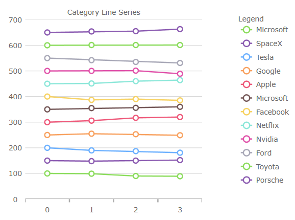 |
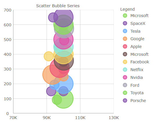 |
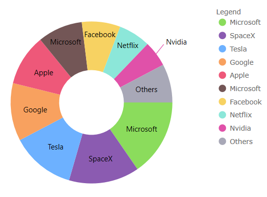 |
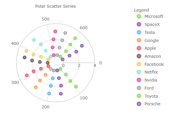 |
チャート凡例
- バブル、ドーナツ、および円チャートで使用できる水平方向の
Orientationプロパティを ItemLegend に追加しました。 LegendHighlightingModeプロパティの追加 - 凡例項目にホバーした時にシリーズのハイライト表示を有効にします。
地理マップ
[!Note] これらの機能は CTP です。
- マップの表示を折り返すためのサポートが追加されました (水平方向に無限にスクロールできます)。
- 座標原点を折り返しながら、一部のマップ シリーズの表示をシフトするためのサポートが追加されました。
- シェイプ シリーズのハイライト表示のサポートが追加されました。
- シェイプ シリーズの一部の注釈レイヤーのサポートが追加されました。
IgniteUI.Blazor (データ グリッド)
EditOnKeyPress、(別名: Excel スタイルの編集) を追加し、入力するとすぐに編集を開始します。EditModeClickActionプロパティを追加しました - デフォルトでは、編集モードに入るにはダブル クリックが必要です。これをSingleClickに設定して、新しいセルを選択するときに編集モードを実行できるようにすることができます。EnterKeyBehaviorsプロパティの追加 - 別名 Excel スタイル ナビゲーション (Enter 動作) - Enter キーの動作を制御します。たとえば、オプションは none、edit、move up、down、left、right です。EnterKeyBehaviorAfterEditプロパティの追加 - 編集モードでは、このプロパティは Enter キーが押されたときを制御します。例えば、オプションは (下、上、右、左のセルに移動) です。SelectAllRowsメソッドを追加しました。- 行範囲の選択を追加しました -
GridSelectionModeプロパティを MultipleRow に設定すると、次の新しい機能が含まれるようになりました:- クリックしてドラッグし、行を選択します。
- SHIFT キーを押しながらクリックして、複数の行を選択します。
- SHIFT キーを押しながら ↑ + ↓ 矢印キーを押して、複数の行を選択します。
- スペース バーを押すと、MultipleRow または SingleRow に設定された
GridSelectionModeプロパティを介してアクティブな行の選択が切り替わります。 - 列オプション ダイアログに列集計を追加しました。
IgniteUI.Blazor (入力)
日付ピッカー
ShowTodayButton- 現在の日付のボタンの表示を切り替えます。Label- 日付値の上にラベルを追加します。Placeholderプロパティ - 値が選択されていない場合にカスタム テキストを追加します。FormatString- 入力日付文字列をカスタマイズします。(例:yyyy-MM-dd)DateFormat- 選択した日付を LongDate または ShortDate のどちらとして表示するかを指定します。FirstDayOfWeek- 週の最初の曜日を指定します。FirstWeekOfYear- 年の最初の週をいつ表示するかを指定します。例えば、最初の 1 週間、最初の 4 日間の週です。ShowWeekNumbers- 週番号の表示を切り替えます。MinDate&MaxDate- 使用可能の選択できる日付の範囲を指定する日付制限。- アクセシビリティの追加