
Infragistics Control Configuratorで高速に書き込み
紹介
Xamarin configurator のUltimate UIコントロールを使用すると、カスタム コンポーネントを作成および設計できます。このレッスンでは、コンフィギュレータを使用して、コードを 1 行も書かずにデータ グリッドを設計および作成します。ビジュアルコンフィギュレータを使用すると、表示する列、列の幅など、グリッドのさまざまな側面を設計できます。
レッスンの目的
このレッスンを修了すると、Ultimate UI for Xamarin Control Configurator を使用して、データ グリッドをすばやく簡単に作成できるようになります。
- プロジェクトを設定する
- データ バインディングを作成する
- グリッドのカスタマイズ
このレッスンで使用するコントロールの詳細については、「Xamarin Data Grid コントロール」ページを参照してください。
ステップ 1プロジェクトを設定する
このレッスンで使用したプロジェクトは、ここをクリックしてダウンロードできます。
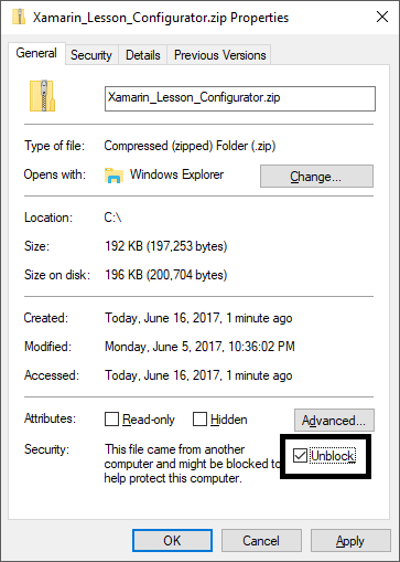
次に、解凍後に初めてプロジェクトを実行するには、ソリューション全体を Visual Studio に読み込み、ソリューションを右クリックして [NuGet パッケージの復元] を選択します。
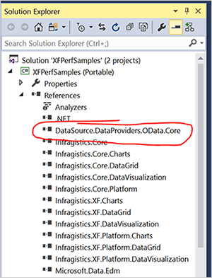
それが完了したら、ポータブル クラス ライブラリと Android プロジェクトの両方への参照を追加してDataSource.DataProviders.OData.Core.dll。このファイルは、ZIP ダウンロードの一部である OtherDependencies フォルダーにあります。これを行うには、プロジェクトの Reference フォルダを右クリックし、[Add Reference]をクリックします。OtherDependencies フォルダーを参照し、DataSource.DataProviders.OData.Core.dllを選択します。
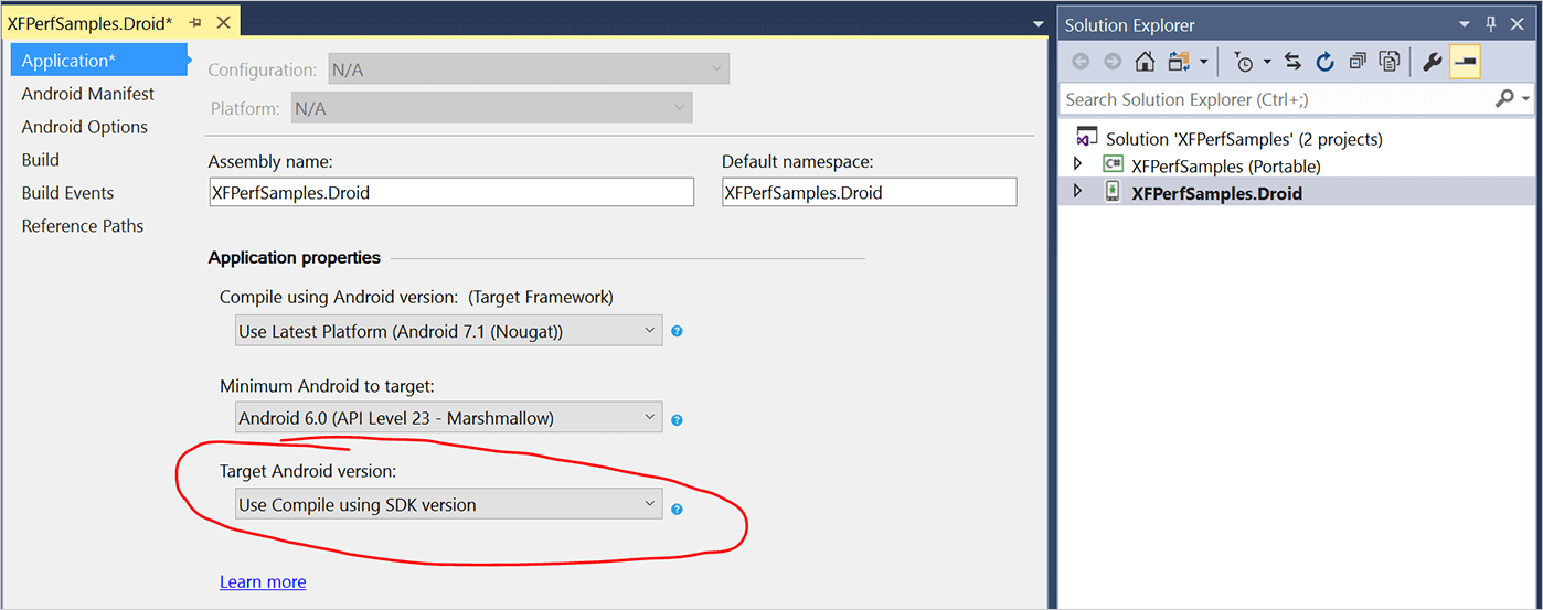
これは、ソリューション内の両方のプロジェクトに対して行います。次に、最後に、[Target Android Version] が [Use Compile using SDK version] に設定されていることを確認します。この設定は、Android プロジェクトを右クリックして [Properties] を選択すると確認できます。
ステップ 2データ バインディングを作成する
必要に応じて、Visual Studio で MainPage.xaml ファイルを開きます。Infragistics ツールボックスから、グリッド オプションを XAML コードにドラッグします。次に、XamDataGrid をツールボックスからスタック レイアウトにドラッグ アンド ドロップします。結果は次の例のようになります。
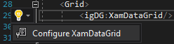
グリッド XAML コードを選択した状態で、電球をクリックし、[XamDataGrid の構成] をクリックしてコンフィギュレーターを開きます。ソリューションをビルドする必要があるというメッセージが表示された場合は、[OK]をクリックします。ソリューションを右クリックし、[ビルド]をクリックして、コンフィギュレーターを起動します。コンフィギュレーターは、キーボードを使用してCtrl + ピリオド + Enterキーで起動することもできます。
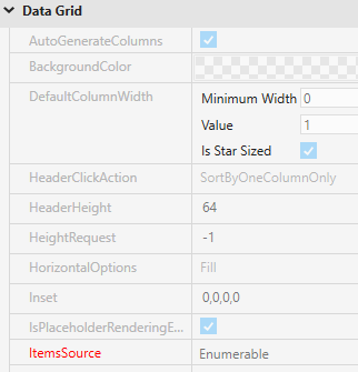
コンフィギュレーターが開くと、データ グリッドのプロパティにいくつかの必須フィールドがあることがわかります。この例の必須フィールドは ItemsSource で、ビュー モデル内のデータにバインドするために必要です。プロパティを変更するには、プロパティラベルの右側にある四角形をクリックし、[データバインディングの作成]をクリックします。
コンフィギュレータは、ページ名を使用してデータバインディングを作成します。MainPage を使用したため、ビュー モデルは MainPageViewModel であると自動的に想定されます。また、ビュー モデルでアクセス可能なプロパティも自動的に一覧表示されます。「People」プロパティを選択し、「バインディングを作成」をクリックします。
![Xamarin Control Configurator の [Create Data Binding] メニュー](https://static.infragistics.com/marketing/Website/products/xamarin/write-fast/control-configurators/databinding.png?v=201706200900)
XamDataGrid は、バインディングのデータを使用して作成されます。コンフィギュレーターは、プロパティのデータ型も識別し、そのデータに基づいてデザインを生成します。この例では、サンプル データは 15 行のデータで開始されます。
ステップ 3グリッドのカスタマイズ
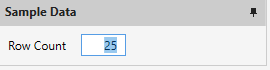
[Row Count] フィールドを25に変更すると、データ グリッドが自動的に拡張され、追加のデータが含まれます。
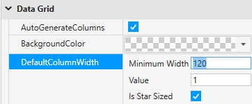
グリッド内のデータが圧縮されているため、読みにくくなっていることに気付くかもしれません。これは、データ グリッドのDefaultColumnWidthプロパティを変更することで修正できます。プロパティを120に設定すると、グリッド内のデータを読み取ることができます。
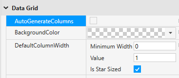
では、データ ソース内のすべての列をデータ グリッドの一部として表示したくない場合はどうすればよいでしょうか。デフォルトの列の最小幅を0に戻して、すべての列が表示されるようにします。次に、AutoGenerateColumnsプロパティを無効にします。列が選択されていないため、データ プレビューは削除されます。
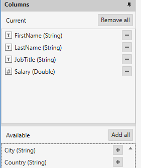
コンフィギュレーターの左側にある [列] パネルには、データ グリッドに追加できる使用可能な列のリストが表示されます。表示する列の横にあるプラスアイコンをクリックします。この例では、次の列を有効にします。
- FirstName (文字列)
- LastName (文字列)
- JobTitle (文字列)
- 給与(ダブル)
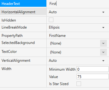
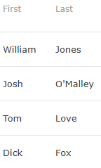
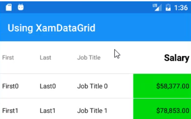
列がプレビューに追加され、列の幅がフィールドに基づいて自動的に設定されることに注意してください。また、列のプロパティを使用して、グリッドでの列の表示方法を操作することもできます。使用可能な列の一覧で [FirstName (String)] を選択します。列のプロパティで、HeaderTextプロパティを "First" のみに変更します。これにより、データ ソースを変更せずに列の表示名が変更されます。列の幅を75に変更し、[星型サイズ]を無効にします。
LastName 列に対してこれらの手順を繰り返して、「Last」とのみ表示されるようにします。
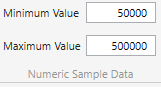
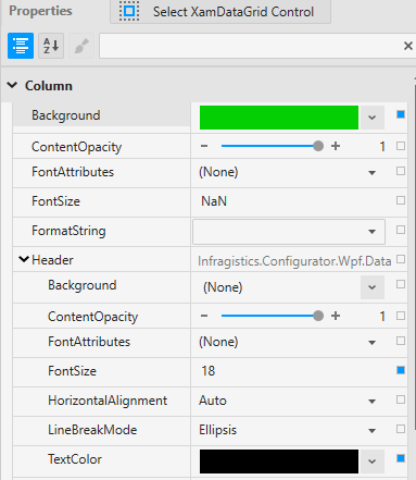
次に、[Salary] 列に進みます。サンプル データは、データの表示方法によって異なることに注意してください。数値サンプルデータの値を変更し、最小値と最大値を設定します。[最小値] を50000に、[最大値] を500000に設定します。
これにより、データの表示方法の一部が修正されますが、それでもお金を表しているように見せたいものです。まず、FormatStringプロパティをCurrencyに設定します。また、列に他の表示変更を加えることもできます。この例で使用されている設定を次に示します。
- TextColor:黒
- 背景:緑
- ヘッダーのフォントサイズ:18
- ヘッダーTextColor:黒
- ヘッダー FontAttributes: 太字
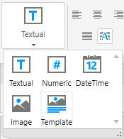
Control Configurator では、データグリッドでデータを視覚的に表示する方法を簡単に変更することもできます。デフォルトでは、コンフィギュレーターは列内のデータ型に基づいて列を設定します。たとえば、FirstName 列は文字列であるため、Text 列として表されます。列の表示方法を変更する場合は、列を選択し、リボンの[型] コンフィギュレーターを使用して別のデータ型を選択するだけです。
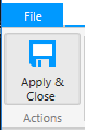
データを希望どおりに構成したら、コンフィギュレーターのData Gridタブをクリックし、Apply & Closeをクリックします。
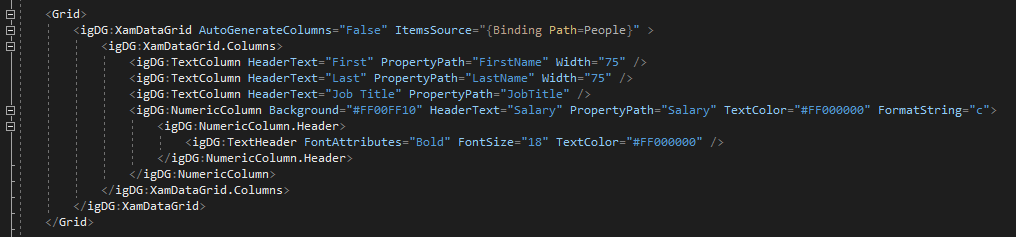
コードの書式を設定すると、コンフィギュレーターで定義したすべてのプロパティが XAML コードで生成されます。
これで、アプリを実行して、データ グリッドが制御コンフィギュレーターを使用して構成したとおりに設計されていることを確認できます。
結論
Infragistics Toolbox は、必要な XAML を自動的に開発するビジュアル コンフィギュレーターを使用して、データ グリッドなどのビジュアル要素を作成するために使用されます。これらのコンポーネントは、コードを 1 行も書かずに作成でき、コンフィギュレーターからすべての詳細を微調整できます。これらのコントロールは、Infragistics Ultimate UI for Xamarinで使用できます。