
Ultimate UI for WPF では、TrendLineLayer は、ターゲット シリーズに対して単一のトレンドライン タイプを表示するように設計された新しいシリーズ タイプです。これと既存のシリーズ タイプの既存のトレンド ライン機能との違いは、TrendLineLayer はシリーズ タイプであるため、チャートの Series コレクションに複数のトレンド ラインを追加して、同じシリーズに複数のトレンド ラインを添付できることです。また、これまでできなかったトレンドラインを凡例に表示する ことも可能です。
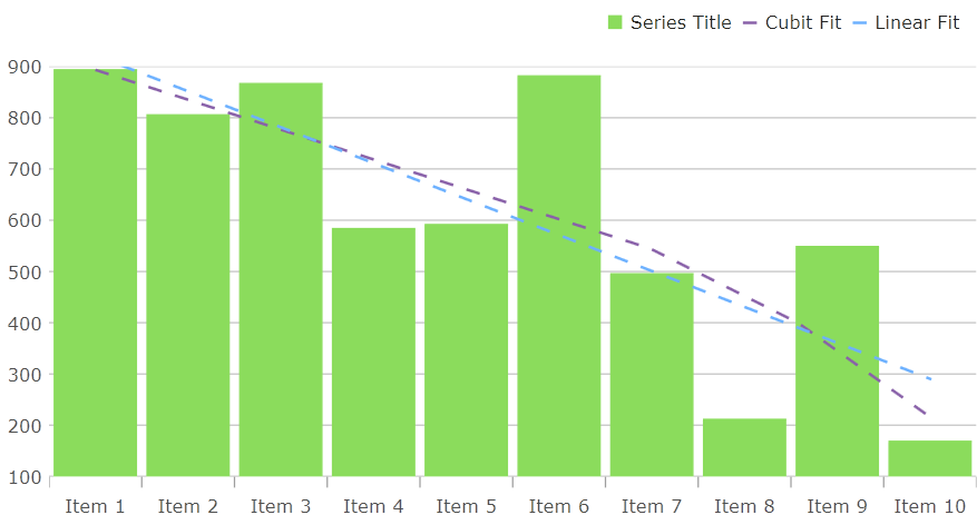
次の画像は、単一の ColumnSeries をターゲットとする複数の TrendLineLayer 要素の使用方法を示しています。
正しく動作させるには、TrendLineLayer に TargetSeries と TrendLineType を指定する必要があります。使用できるさまざまなトレンドラインのタイプは、シリーズで使用できたトレンドラインと同じです。これについては、このトピックで説明されています。
Legend に TrendLineLayer を表示する場合は、UseLegend プロパティを true に設定します。
次のコード スニペットを使用すると、上記のスクリーンショットと同じチャートを再現できます。
XAML の場合:
<Grid x:Name="layoutRoot">
    <ig:XamDataChart Legend="{Binding ElementName=legend}">
        <ig:XamDataChart.Axes>
            <ig:CategoryXAxis x:Name="xAxis" ItemsSource="{Binding Data}" Label="{}{Label}" />
            <ig:NumericYAxis x:Name="yAxis" MinimumValue="0" MaximumValue="1000"/>
        </ig:XamDataChart.Axes>
        <ig:XamDataChart.Series>
            <ig:ColumnSeries x:Name="series1" XAxis="{Binding ElementName=xAxis}"
                             YAxis="{Binding ElementName=yAxis}"
                             ItemsSource="{Binding Data}"
                             ValueMemberPath="Value" />
            <ig:TrendLineLayer TargetSeries="{Binding ElementName=series1}"
                   TrendLineType="CubicFit"
                   UseIndex="True"
                   UseLegend="True"
                   Title="Cubit Fit"/>
            <ig:TrendLineLayer TargetSeries="{Binding ElementName=series1}"
                   TrendLineType="LinearFit"
                   UseIndex="True"
                   UseLegend="True"
                   Title="Linear Fit" />
        </ig:XamDataChart.Series>
    </ig:XamDataChart>

    <ig:Legend x:Name="legend" Orientation="Horizontal" />
</Grid>
C# の場合:
Legend legend = new Legend() { Orientation = Orientation.Horizontal };
XamDataChart chart = new XamDataChart() { Legend = legend };

CategoryXAxis xAxis = new CategoryXAxis()
{
    ItemsSource = data,
    Label = "{Label}"
};

NumericYAxis yAxis = new NumericYAxis()
{
    MinimumValue = 0,
    MaximumValue = 1000
};

ColumnSeries series1 = new ColumnSeries()
{
    XAxis = xAxis,
    YAxis = yAxis,
    ItemsSource = data,
    ValueMemberPath = "Value"
};

TrendLineLayer linearLayer = new TrendLineLayer()
{
    TargetSeries = series1,
    TrendLineType = TrendLineType.LinearFit,
    UseIndex = true,
    UseLegend = true,
    Title = "Linear Fit"
};

TrendLineLayer cubicLayer = new TrendLineLayer()
{
    TargetSeries = series1,
    TrendLineType = TrendLineType.CubicFit,
    UseIndex = true,
    UseLegend = true,
    Title = "Cubic Fit"
};

chart.Axes.Add(xAxis);
chart.Axes.Add(yAxis);

chart.Series.Add(series);
chart.Series.Add(linearLayer);
chart.Series.Add(cubicLayer);

layoutRoot.Children.Add(chart);
layoutRoot.Children.Add(legend);デフォルトでは、TrendLineLayer は、TargetSeries と同じ色の破線で描画されます。これは、TrendLineLayer のさまざまなスタイル設定プロパティを使用して構成できます。
描画されるトレンドラインの色を変更するには、Brush プロパティを設定します。あるいは、UseIndex プロパティを true に設定することもできます。これにより、TrendLineLayer がチャートの Series コレクションに配置されているインデックスに基づいて、チャートの Brushes パレットからブラシが取得されます。
TrendLineLayer の表示方法は、AppearanceMode プロパティと ShiftAmount プロパティを使用して変更することもできます。ShiftAmount は、-1.0 から 1.0 の範囲の double を受け取り、「Shift」 で終わる列挙体オプションに適用する 「シフト」 の量を決定します。
AppearanceMode 列挙体のオプションは次のとおりです。
Auto: デフォルトでは DashPattern 列挙体になります。
BrightnessShift: トレンドラインは、TargetSeries ブラシを取得し、提供された ShiftAmount に基づいて明るさを変更します。
DashPattern: トレンドラインは破線として表示されます。ダッシュの頻度は、TrendLineLayer の DashArray プロパティを使用して変更できます。
OpacityShift: トレンドラインは、TargetSeries ブラシを取得し、提供された ShiftAmount に基づいて不透明度を変更します。
SaturationShift: トレンドラインは、TargetSeries ブラシを取得し、提供された ShiftAmount に基づいて彩度を変更します。