


高速 Web Components データ グリッド
Ignite UI for Web Components は、世界最速の仮想化された Web Components データ グリッドを含む、Web Components ネイティブのマテリアル ベースの UI コンポーネントの完全なライブラリを提供します。
Web Components Grid の例
この Web Components グリッドの例では、データの検索とフィルタリング、列のソート、サイズ変更、ピン固定と非表示、行の選択、Excel と csv へのエクスポート、水平および垂直スクロールなど、グリッドに組み込まれているさまざまな機能を利用してユーザーがデータ ビューをカスタマイズする方法を確認できます。Linear Progress Bar Indicator やスパークラインなどのコンポーネントを含むセル テンプレートの例を提供しました。その他の機能については、こちらをご覧ください。
Web Components Grid の概要
Web Components データ グリッドは、一連の行と列で表データを表示するために使用されるコンポーネントです。テーブルとも呼ばれるデータ グリッドは、Microsoft Excel などの一般的なソフトウェアでデスクトップの世界でよく知られています。グリッドはデスクトップ プラットフォームで長い間利用されてきますが、最近 Web Components UI などの Web ア プリ UI の一部になりました。最新のグリッドは複雑で、データ バインディング、編集、Excel のようなフィルタリング、カスタム ソート、グループ化、行の並べ替え、行と列の固定、行の集計、Excel、CSV、PDF 形式のエクスポートなど、さまざまな機能が含まれる場合があります。
Web Components Grid の利点
Web Components データ グリッドは、大量のデータをすばやく保存してソートする必要がある場合に重要です。これには、大量の高速データを頻繁に使用する金融や保険などの業界が含まれます。これらの企業の成功は、データ グリッドの機能とパフォーマンスに依存します。たとえば、在庫をマイクロ秒単位で決定する場合、データグ リッドが遅延時間やちらつきのない状態で実行する必要があります。
主要機能
Ignite UI for Web Components のデータ グリッドは、大量のリアルタイム データのみにとどまるものではありません。これは機能豊富な Web Components グリッドであり、ごくわずかなコードだけでは実現できない機能を提供します。
以下は、データ グリッドの主な機能のいくつかを示しています:
数百万のレコードをロードできる仮想化された行と列
インタラクティブな Outlook スタイルのようなグループ化
グリッド セルまたは列のデータに基づいた列集計
行の高さとサイズ変更を調整するサイズ
データの仮想化とパフォーマンス
データ グリッドの列と行レベルの仮想化により、Web Components グリッド内の無制限の行と列をシームレスにスクロールします。ローカルまたはリモートのデータソースのサポートにより、データがどこにあっても最高のパフォーマンスを得ることができます。ユーザーは Excel のようなスクロールを体験し、エンタープライズ スピード (ラグ、画面のちらつき、視覚的な遅延) なしで、パフォーマンスを損なうことなく最高のユーザー エクスペリエンス (UX) を提供します。

Quick and Easy to Customize, Build and Implement
The Ignite UI Web Components Data Grid can handle unlimited rows and columns of data, while providing access to custom templates and real-time data updates. Featuring an intuitive API for easy theming and branding, you can quickly bind to data with minimal code.
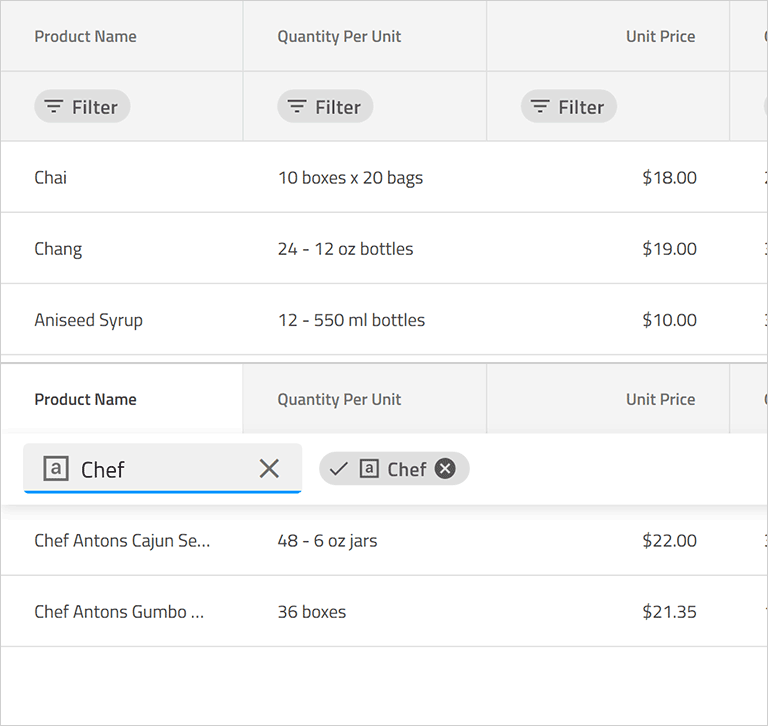
Web Components グリッドのページング、ソート、フィルタリング & 検索
Allow users to navigate your data set with our default pager or create your own template to give your own paging experience. With complete support for single and multi-column sorting, full-text search on the grid, and several advanced filtering options, including data-type based Microsoft Excel-style Filtering.
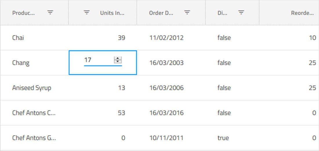
インライン Web Components グリッド編集
We provide you default cell templates for editable columns which are based on the data type of the column. You can define your own custom templates for editable columns and override default behavior for committing and discarding changes in the cell value.
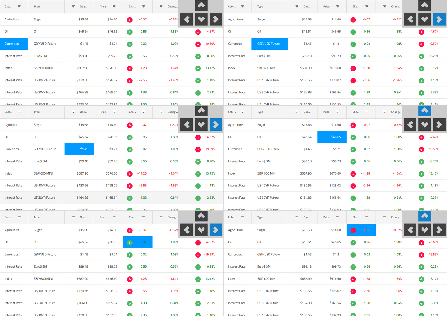
キーボード ナビゲーションと行/セルの選択
Ensure accessibility compliance and improve usability, enabling Excel-like keyboard navigation in the Web Components data grid, using the up, down, right, left, tab, and Enter keys. You can toggle single or multiple row selection in the Web Components grid using the mouse or keyboard to select or de-select full rows, or use the built-in select all / de-select all checkbox in the grid toolbar to work with row selection. Learn about our most recent enhancements to this feature.

Web Components グリッドのアクセシビリティと ARIA のサポート
Each of our Web Components components in Ignite UI for Web Components has been implemented according to the latest accessibility guidelines and specifications. Our Web Components components have been tested using OS or Browser provided accessibility technology – screen readers. Our team ensures not only that the guidelines are implemented, but also that the actual content delivered to visually impaired or blind people is actually consumable and user-friendly for them. The Ignite UI for Web Components data grid is fully accessible with a11y Keyboard accessibility, ARIA, and accessible color palette. Learn more.
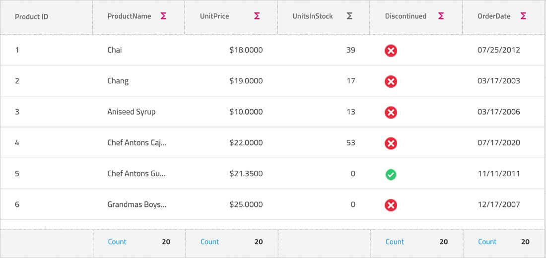
列のグループ化、ピン固定、集計
Group columns or pre-set column groups via mouse interaction, touch or our API, with support for built-in column summaries or custom summary templates. Enable users to interactively hide or move columns, with full support for interactive column pinning, during move, drag, and reorder operations.
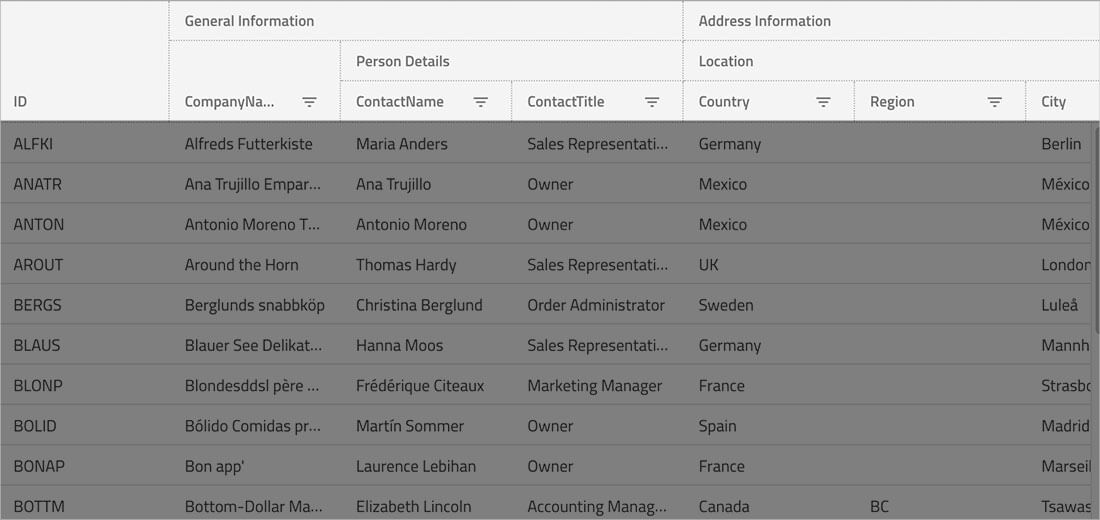
複数列ヘッダー
Enable multi-column headers, allowing you to group columns under a common header. Every column group could be a representation of combinations between other groups or columns, with full support for column pinning, interactive column moving within groups, sorting, and hiding groups.
Web Components Grid の機能
Download the Fastest Web Components Grid Today!
30 日間無償お試し版。クレジット カードは不要です。
Ignite UI for Web Components Supported Browsers
Web Components Data Grid は、すべての最新の Web ブラウザーでサポートされます。
- Chrome
- Edge / Edge Chromium
- Firefox
- Safari
- ポリフィルを使用した Internet Explorer 11
Ignite UI for Web Components サポート オプション
Infragistics の Web Components 製品の受賞歴のあるサポートにアクセスするための複数のオプションがあります。
- Web Components サポート ホーム ページをご覧ください。
- Web Components ドキュメントを読み、Web Components サンプルを試してください。
- 最新の情報は、Web Components ブログをご覧ください。
- サポート ケースの送信
- Web Components 参照アプリケーションを試してください。
Ignite UI for Web Components 試用ライセンスおよび商用
Ignite UI for Web Components is a commercially licensed product available via a subscription model. You can try the Ignite UI for Web Components product for free when you register for a 30-day trial. When you are done with your Trial Period, you can purchase a license from our web site or by calling sales in your region.
FAQ
- 数百万のレコードをロードできる仮想化された行と列
- セル、行、および一括更新オプションを使用したインライン編集
- Excel スタイル フィルタリングと Excel キーボード ナビゲーション機能
- インタラクティブな Outlook スタイルのようなグループ化
- グリッド セルまたは列のデータに基づいた列集計
- Excel へのエクスポート
- 行の高さとサイズ変更を調整するサイズ
Web Components コンポーネントは、Ignite UI バンドルの一部として含まれています。価格の詳細については、価格ページを参照してください。
複数のプラットフォームでアプリケーションを開発する場合、WPF や Windows Forms などのデスクトップ プラットフォーム、Web Components、Web コンポーネント、ASP.NET MVC、ASP.NET Core のすべての最新 Web ツールセットを含む完全なアプリ開発パッケージ Infragistics Ultimate を検討してください。
Web Components Data Grid を個別に購入することはできません。これは Ignite UI 製品バンドルの一部です。Ignite UI 製品バンドルは、Web Components、ASP.NET MVC、Web コンポーネント、ASP.NET Blazor などのすべての Web プラットフォームに対して、何百ものコントロール、コンポーネント、およびデータの視覚化を提供します。
Web Components Data Grid の使用を開始するには、作業の開始ガイドの手順を実行してください。サンプル アプリケーションのライブラリも用意しています。サンプル ライブラリは、Web Components 開発のベスト プラクティス ガイドです。